Nov. 18, 2010 - Feb. 15, 2011
My livelihood as an artist, not to mention the livelihood of all hard working Americans, is under attack by unstable Tea Bag politicians who represent the interests of only a very small minority. That makes it 'on topic' and fair game in an art blog.
Sure, the Tea Baggers may have support among some numbers of gullible and intellectually slackish conservative rank and file voters, but unless those misguided followers are billionaires, they will receive no benefit from Tea Bag policies. In fact, they carry water for policies that will further undermine the country's economic well being, assuring we'll never recover from the Bush recession.
Tea Bag politicians, who possess no normal sense of limits, deliberately held the nation's economic stability--and by extension our national security--in jeopardy, and plan to continue to do so at every opportunity. There are real damages occurring as a result and we're only seeing the beginning. Doesn't that actually make them enemies of the U.S.? Isn't that treason? Why aren't they in jail?
I respect one's right to their opinions, but I draw the line when extremist ideology infringes on my right to life, liberty and the pursuit of happiness. Not to mention damaging my investments.
The following links should be required reading for every U.S. citizen:
A Timeline of Events
Who's Debt?
Our announcement cards, which we mailed through the postal service, were 4" x 6," which means we had to fit the images of 3 artists, our names, the title of the show, the Arts Council name, location and phone number, and the duration of the exhibit all on that small card. On those cards that I sent specifically as invitations to the opening (as opposed to those sent merely announcing the show in general), I wrote the reception dates and times on the address side of the card, opposite the pre-printed address labels. I've come to the conclusion that for a group show, even a small group show like ours, the card must be larger, OR you have to come up with a single image or design that relates to the theme of or unifies the show, rather than trying to squeeze the images of three artists' work and their names onto the front of the card along with all of the other necessary information. Our art images, although small, were very 'legible,' but even so, space for the required text was reduced.
We had larger posters placed in many strategic locations, both locally and out of town, and I know that people saw them because they've told me they did. These days it is really difficult to stand out against so many competing activities, information and images, we are constantly bombarded with stimuli, so I do feel satisfied that our design worked on the larger scale of the poster.
A friend told me about 'evite,' an online service that allows you to send invitations to events over the internet and to get direct responses from invitees, messages, and RSVP's. It sounds like a really good idea, but the 'old school' part of me--and that's a large part--believes that printed invitations and announcements sent by good, old fashioned snail-mail are the elegant, quality way to go. Perhaps in this day and age, in order to get people's full attention we have to use all the tools available to us.
14" x 11"
oil on canvas
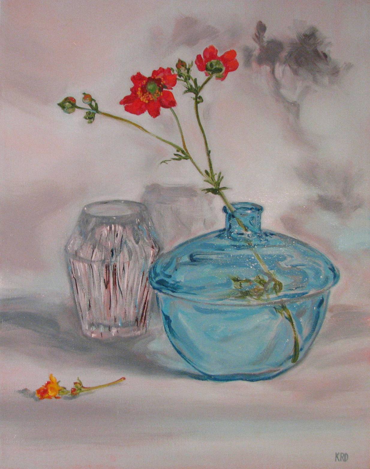
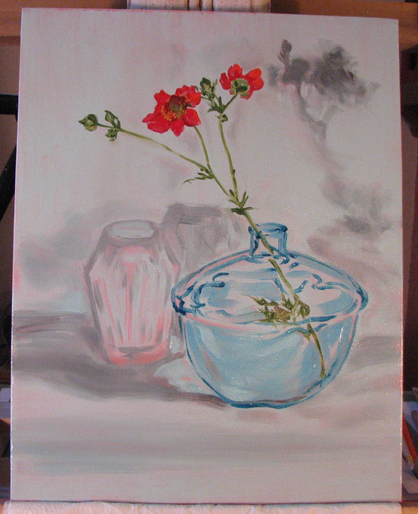
The bud on the left has now opened, revealing a golden-red, kind of stunted bloom. I'm considering snipping it off and placing it somewhere in the lower left quadrant of the composition.

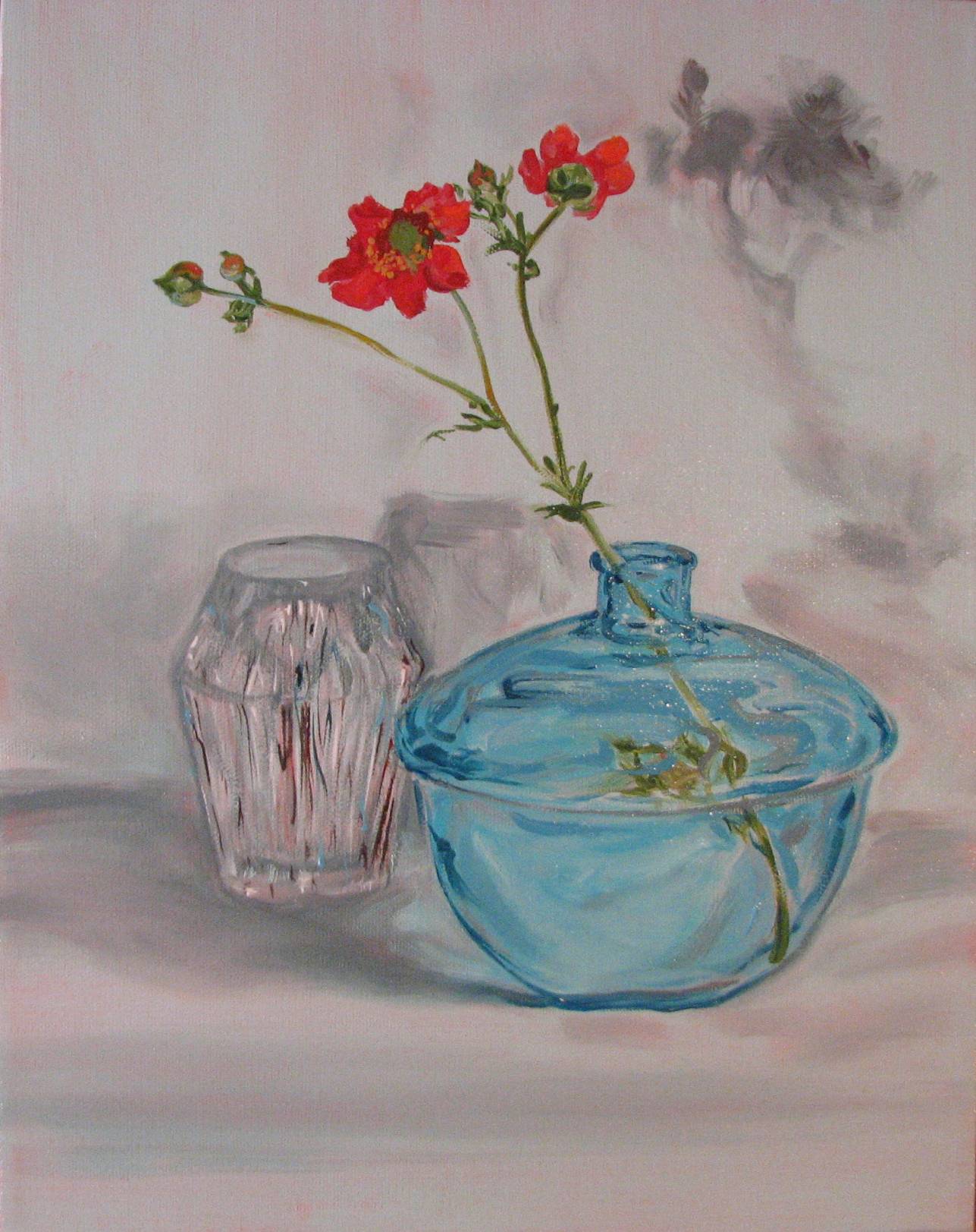
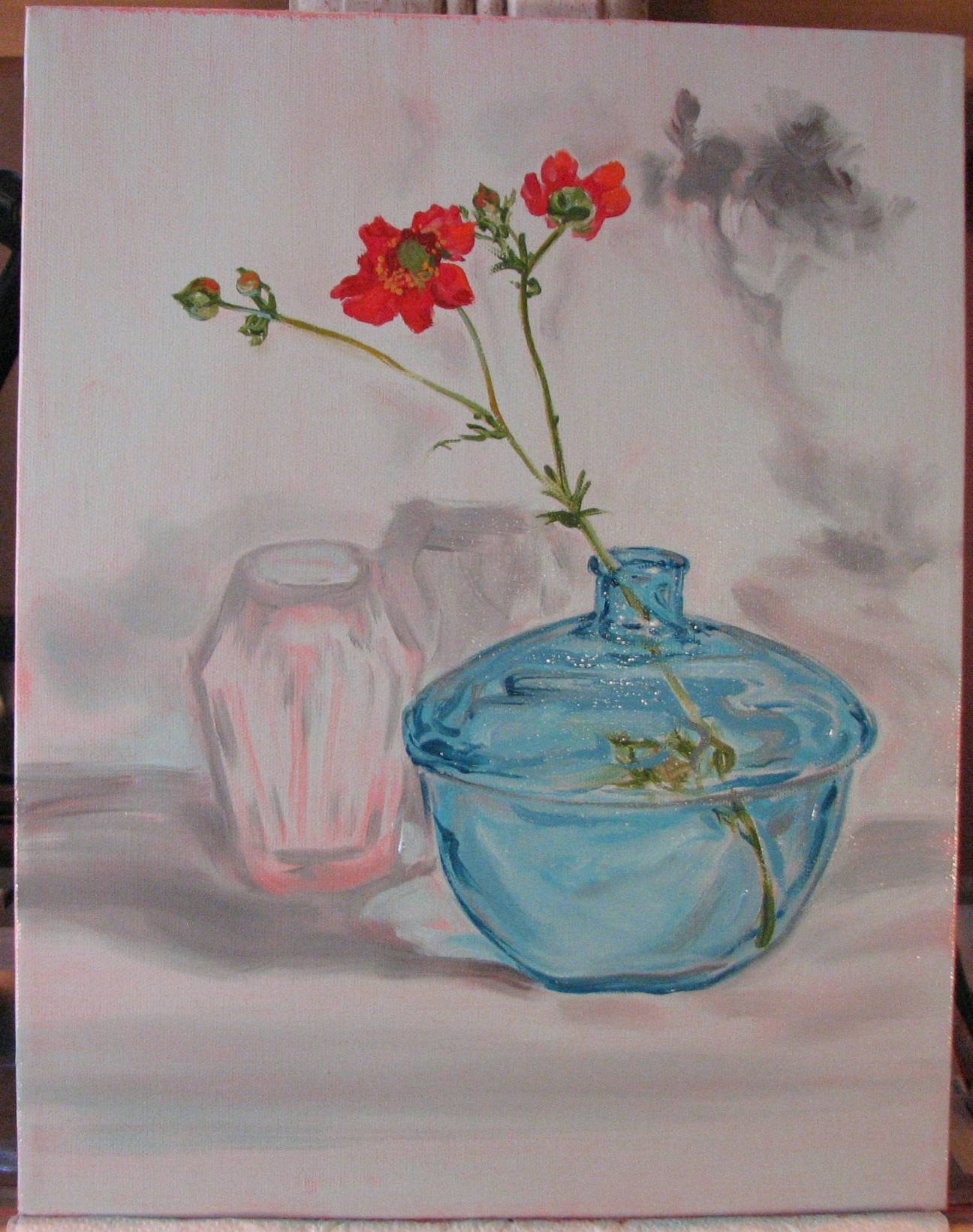
I've discovered that cut flowers are definitely NOT static; they move and change position over time, likely due to changing heat, light and moisture conditions. I cut this blossom about 6:00 p.m. last night, and over the evening it changed a lot, with the rear blossom turning completely around to face me by 11:00 p.m.! It seems to have returned closer to its original position today, however.
Also for the first time I tried initially toning the canvas with a salmon pink color and allowing that to set for 24 hours before glazing over it with a pale aqua blue and placing the objects. The flower sprig is just about complete, while the glass objects and shadowed areas need greater development. I'm havin' some fun with this one...
The southwestern plants in our gardens are beginning to produce some blooms, which I hope to incorporate into the still life in some way. People outside the region assume that xeric gardens of the southwest are stark and colorless, but nothing could be further from the truth. Xeric plants are just spectacular!
oil on transparent gessoed canvas
20" x 20"
For Alice (1919-May 6, 2007) Miss you, Mom!
There has been a lot of widespread attention focused on Weiwei's situation, but I have to admit that the intensity and extent of the attention has me a bit baffled. Tragically, he is not the first person to have been imprisoned or otherwise suppressed for human rights activism. There are those who have been languishing in prisons for years. Others have simply disappeared. So why the intense focus on one Chinese artist?
I suspect that for some opportunists on the right (who’ve perhaps never in their entire lives written a simple prisoner advocacy letter for Amnesty International, or taken part in a street vigil to raise awareness of human rights issues), Weiwei serves as a really handy vehicle with which they can continue to irrationally slam President Obama. Do they really have any long term, sustained (and documented) interest in global human rights? And after their punching bag Obama leaves the White House, will they still care? For now, however, it’s politically useful. Those critics don’t deserve serious attention, and hopefully they are few and far between.
I’m just your average, unabashedly liberal New Mexico artist, I don’t pretend to be an expert in geopolitical dynamics or world economics, and I certainly can't read the President's mind, but I do pay attention when I watch true experts discussing these kinds of issues, and with my evening dose of ‘The Nightly Business Report’ as a regular backdrop to current events, I have generated some thoughts on the matter.
Weiwei has indeed taken up some extremely compelling human rights causes. Thus, any sincerely motivated questioning of Obama's perspective would appear to be valid. Why then, the allegedly passive reaction on the part of our President (although in fairness, technically the U.S. government has taken a stand on the matter via statements by our Ambassador to China, Jon Huntsman). However, these things are never really neatly black and white, are they?
China is experiencing a phenomenal 10% economic growth rate while many of the world’s economies are struggling, including that of the U.S., as we are all well aware. The Chinese government has achieved this impressive growth in large measure because they’ve placed economic development, massive infrastructure transformation and urbanization well ahead of concerns about democratic reforms—much needed reforms that would jeopardize the scope and curtail the pace of the monumental changes that the Chinese government wishes to implement. (Does anyone remember China’s Three Gorges dam project, which sacrificed countless cities and villages, displaced hundreds of thousands of people, submerged and degraded unique environments, destroyed priceless paleontological and archaeological sites, and endangered wildlife?) President Obama is an articulate and intelligent guy, but I suspect even he can't contain the tidal wave force of a 10% Chinese economic growth rate--particularly when it's not just the Chinese who are benefiting. Obama's foreign policy strategy has been described as that of "engagement" and "diplomacy" rather than "hectoring," which also may account for the perceived lack of sharp response from the President.
Meanwhile, U.S. business, and many conservatives, have criticized President Obama for being hostile to American business, and U.S. businesses clearly have been benefiting from China’s growth, which is unfortunately occurring at the expense of democratic reforms. For example, the Caterpillar company’s sharp activity and profits are attributable to the need for construction equipment in, among several emerging regions…China. There are concerns, however, regarding growing economic and trade pressures between the U.S. and China and their potential for detriment to U.S. business (Fox News), (NYTimes).
Even so, elected conservatives in Washington are threatening to once again damage the the world economy, this time by holding the U.S. debt ceiling hostage to passage of their economically destructive federal 'austerity' agenda (a foolhardy austerity plan similar to the one that is currently crippling the growth of Britain’s economy as I write, and a plan that is a complete sham as long as Republicans in Congress refuse to end tens of billions of dollars in taxpayer subsidies to obscenely profitable Big Oil corporations who don't need them and don't want them). Here is a link for an explanation of the havoc this maneuver would create.
Little wonder that President Obama might view direct criticism of China's treatment of Weiwei as an unpredictable landmine with potential fall out on many fronts, thanks in part to conservatives' many, destructive, and contradictory demands.
Against all of this inescapable background, I really don’t want to hear conservatives--especially those who claim to be fiscal conservatives--criticizing President Obama for not speaking up at this time about Weiwei. So. Here’s the choice for conservatives: you can criticize Obama for being hostile to U.S. business. You can criticize Obama for not directly speaking out for Weiwei. But you can’t do both with any credibility. Furthermore, you can call off the conservative austerity dogs so that Congress can deal in a responsible manner with the debt ceiling, and stop blaming Obama and the Democrats for fiscal and economic conditions that failed conservative economic philosophy and policy largely created! Stop criticizing and undermining the crisis measures that had to be taken to address the Bush Recession. Then there can be talk about what Obama's response should actually be to the imprisonment of Chinese artist and activist Ai Weiwei.
I've lost count of how many neglected animals we've had to deal with here in New Mexico, invariably owing to someone else's irresponsiblity. We had no pets when we bought this house and moved in, but little did we know that the property came with a stealth cat colony consisting of a mother stray and her kittens. OK, so we've taken her in, taken in two of her subsequent litters, had everyone spayed and neutered, and still the cats keep coming. We love New Mexico, but one of its few drawbacks is the abysmal state of its animals. I've never lived anywhere that had so many stray, abandoned, neglected and abused critters. It is heartbreaking. And the thing is that it is relatively EASY to contain the populations through conscientious spay and neuter practices. There are some wonderful people working hard to address the problem in my county, but after decades of out of control population growth it's proving very hard to keep up.
So why don't we take in this new stray? We've adopted 5 former strays that we rescued who are now domesticated enough to be indoors part of the time, and we're looking after an additional 2 ferals who come here at night to feed and then leave by dawn. It's a stable colony that is entirely spayed and neutered, and as long as there are no 'newcomers' everyone is happy. Our littlest male, 'Mouse,' however, is very sensitive to bigger males, and each time new males start coming around Mouse shakes like a leaf, begins to lose his fur from stress, and eventually takes off for parts unknown until the newcomers are gone. Last year at this time he was scared off for 25 days and returned emaciated and just about near death. He's lost half of his fur this time and has been gone for 2 days, so I'm making frantic calls to all the cat rescue people in town trying to find someplace for the new stray cat to go where he'll find a good home. I think I may have found an answer, but I've got to spend the rest of the day dealing with it. Hopefully Mouse isn't too far off, and he'll show up soon.
UPDATE: Good news for the stray--he is in the process of going to a good home, and is receiving medical care. And Mouse returned within hours of transferring the stray to the shelter.
Spay and neuter your animals!
oil on transparent gessoed canvas
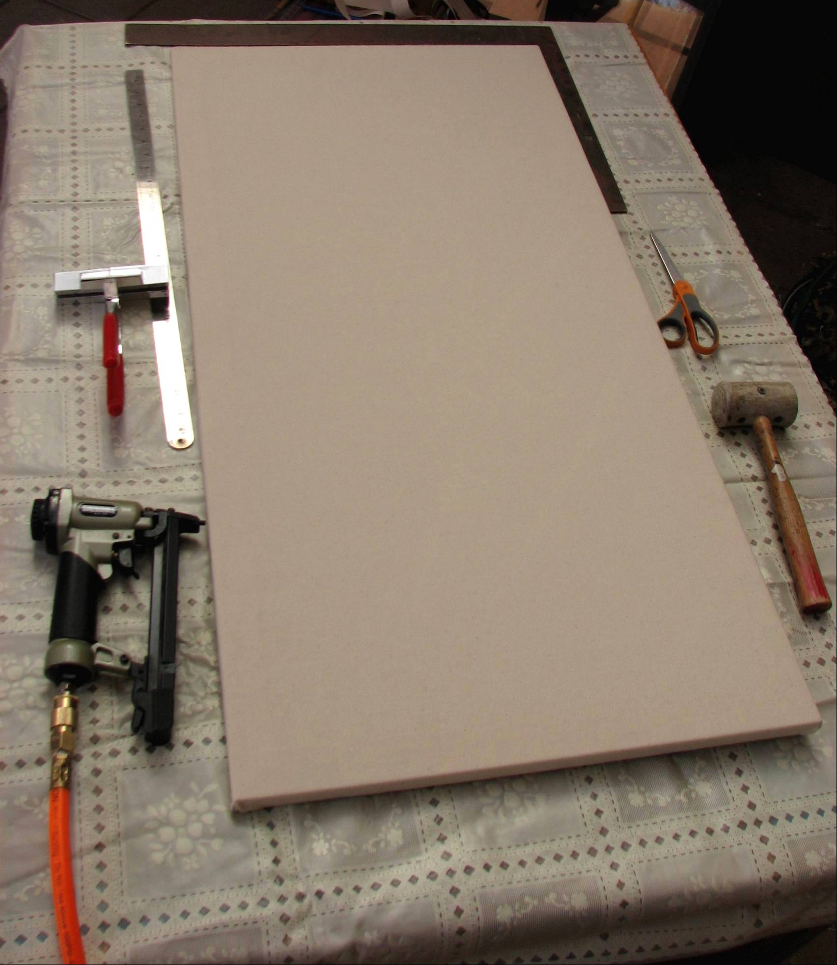
In my initial efforts to find the Holy Grail of oil painting supports, I've been getting a medium weight 'raw' canvas, meaning it hasn't been pre-primed, and this has been a deliberate choice. There are many kinds of woven painting substrates in a variety of price ranges available, especially at one store I regularly shop at, but I wanted a support that looked kind of homespun because there are areas where I do leave the canvas exposed. Instead of priming my stretched canvases with white gesso, I sought out a transparent gesso and the only brand I could find was Liquitex. It has turned out to be great for my purposes. It dries completely transparent, but has a little fine grit in it and this provides the sharp 'tooth' I want. Commercially prepared canvases were generally too smooth, and I wanted something with a little more drag or tooth to it.
The clerks at the art supply store told me to sand between coats of gesso, but I haven't been doing that precisely because I'd lose that sharp tooth. I've been giving the canvases two good coats of transparent gesso and they're good to go. In the future I'm going to keep my eye out for atypical woven materials that I can experiment with. Actually, I'm anxious to try some of the possibilities. Finished paintings on the canvases I prepared in the above described manner include 'The Santa Fean,' 'Blue Pericon,' and 'Red and Blue Pericons.' The 'homespun' character of the support is especially well suited to and apparent in 'The Santa Fean.' I haven't entirely sworn off of commercially prepared canvases, and I do like Winsor Newton's canvases, but for many of the paintings I want to do my own method seems the best way to get the surface I'm seeking.
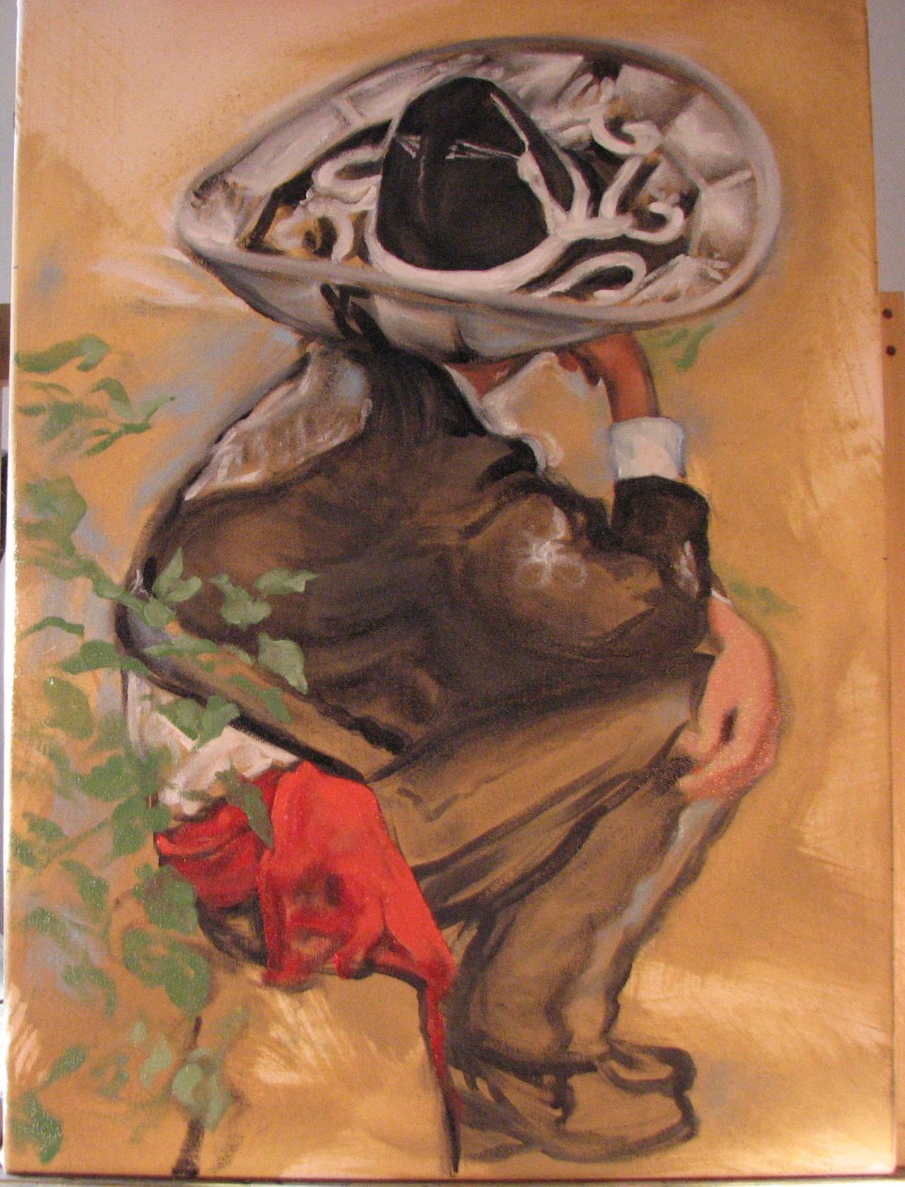
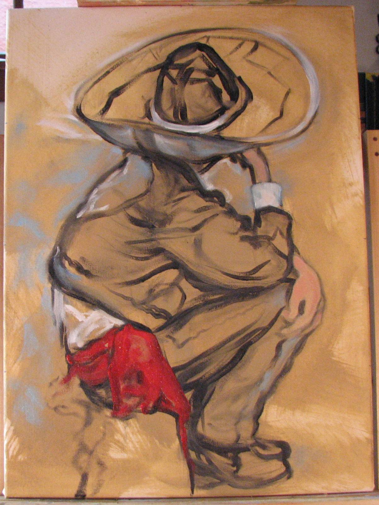
Update, April 24: I put this painting aside for a few days and took another look at it from a distance. I felt it wanted a little greater emphasis here and there, so I strengthened some lines and punctuated some small areas. Nothing major, but sometimes these things become apparent when you haven't been focusing so intently on a painting for a little while. I'll leave the previous image up for comparison. In some ways the previous state did keep the eye focused on the upper part of the painting, but in the last state the hands are better connected to the entire figure.
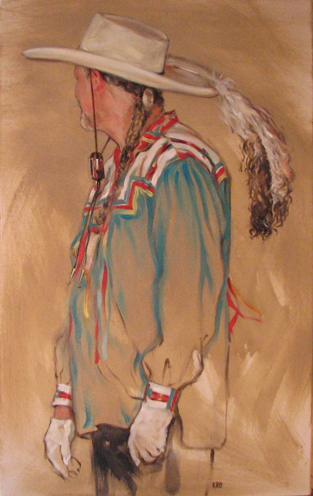
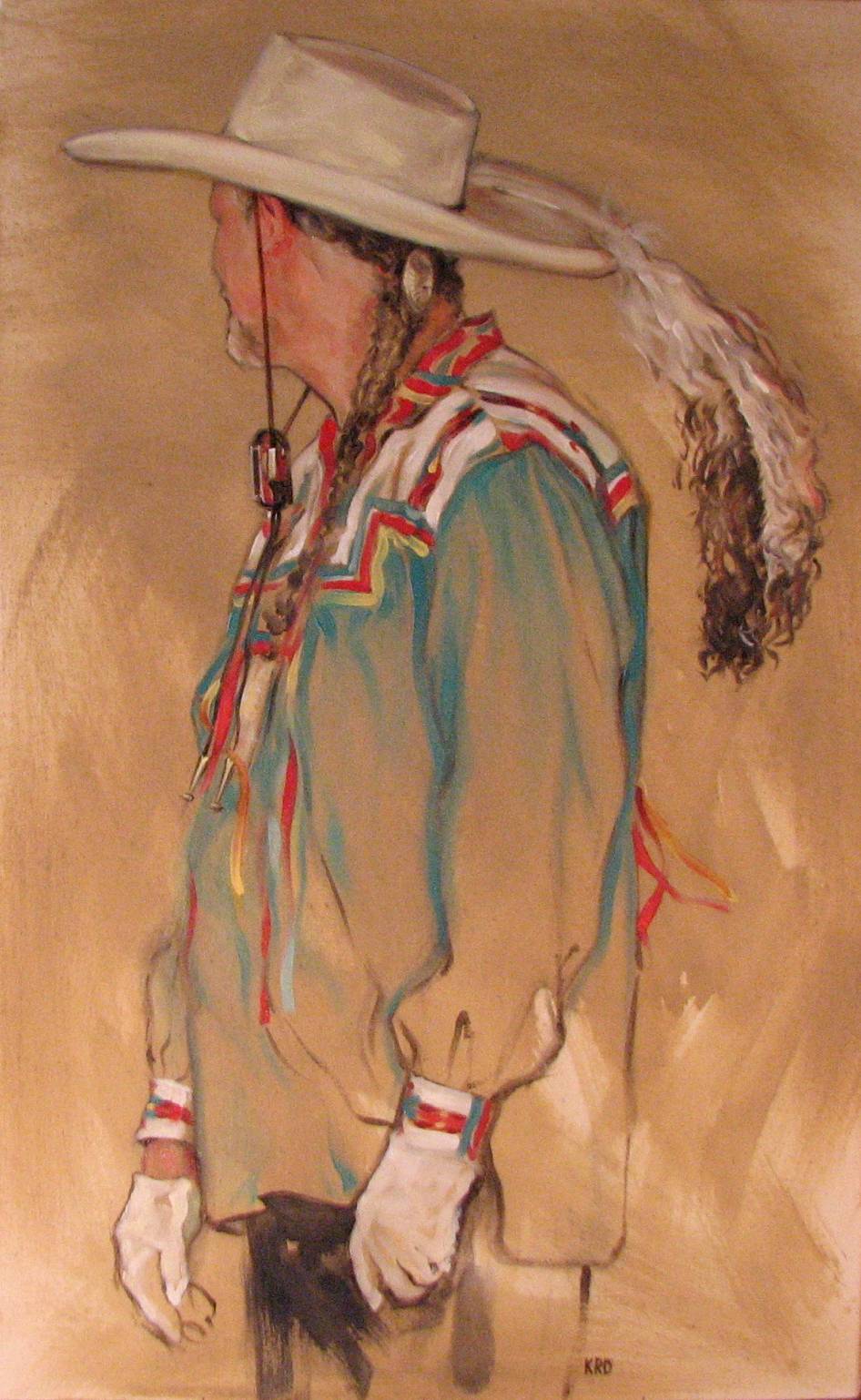
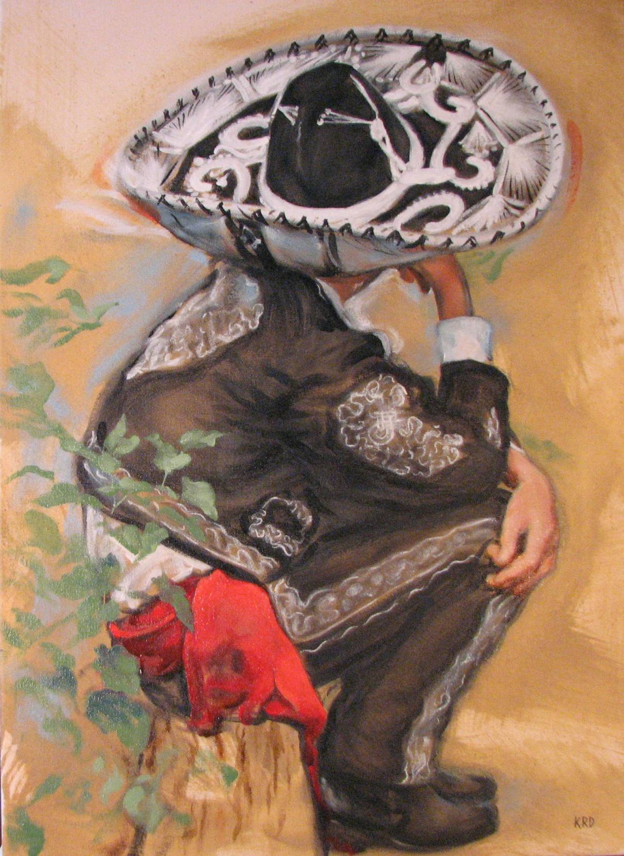
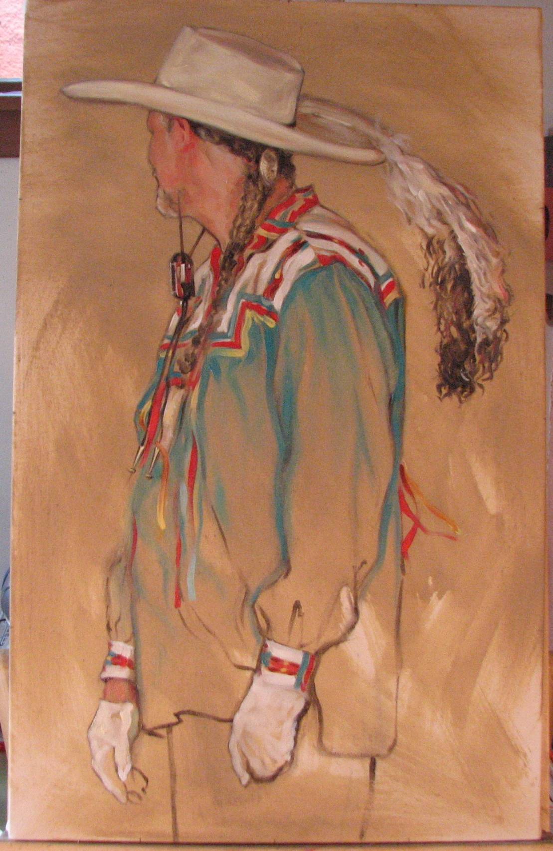
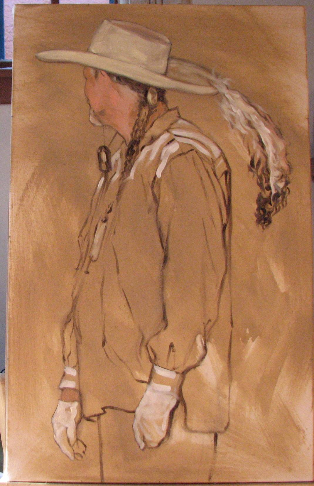
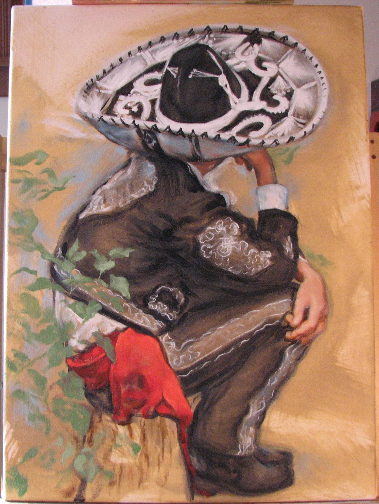
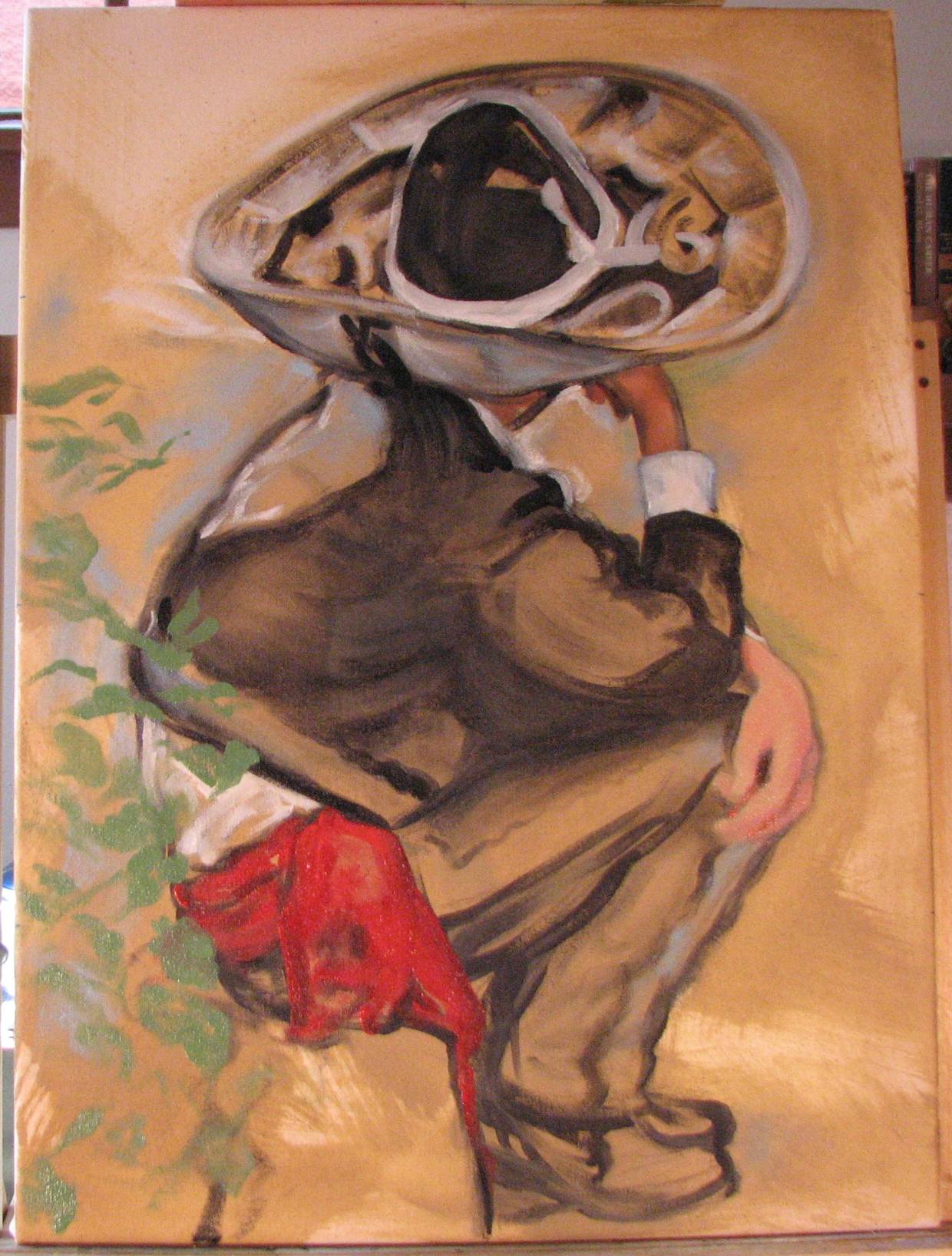
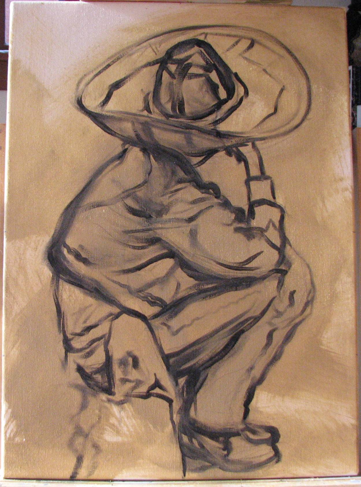
I started an oil on canvas that I stretched and prepared myself, this time a portrait of a resident of Santa Fe. He's a Spanish Colonial artist that I saw at Spanish Market in Santa Fe. Gotta love that southwestern flair!
The sweeping line from the hat to the feather and down the figure's arm forms the compostional structure of the painting. It was critical to get that sweep right, including the character of the feather's delicate fibers. I was also interested in the silver hair ornament at his neck and braid, and the bolo type fastener keeping his hat strings secured. That's an amazing hat.
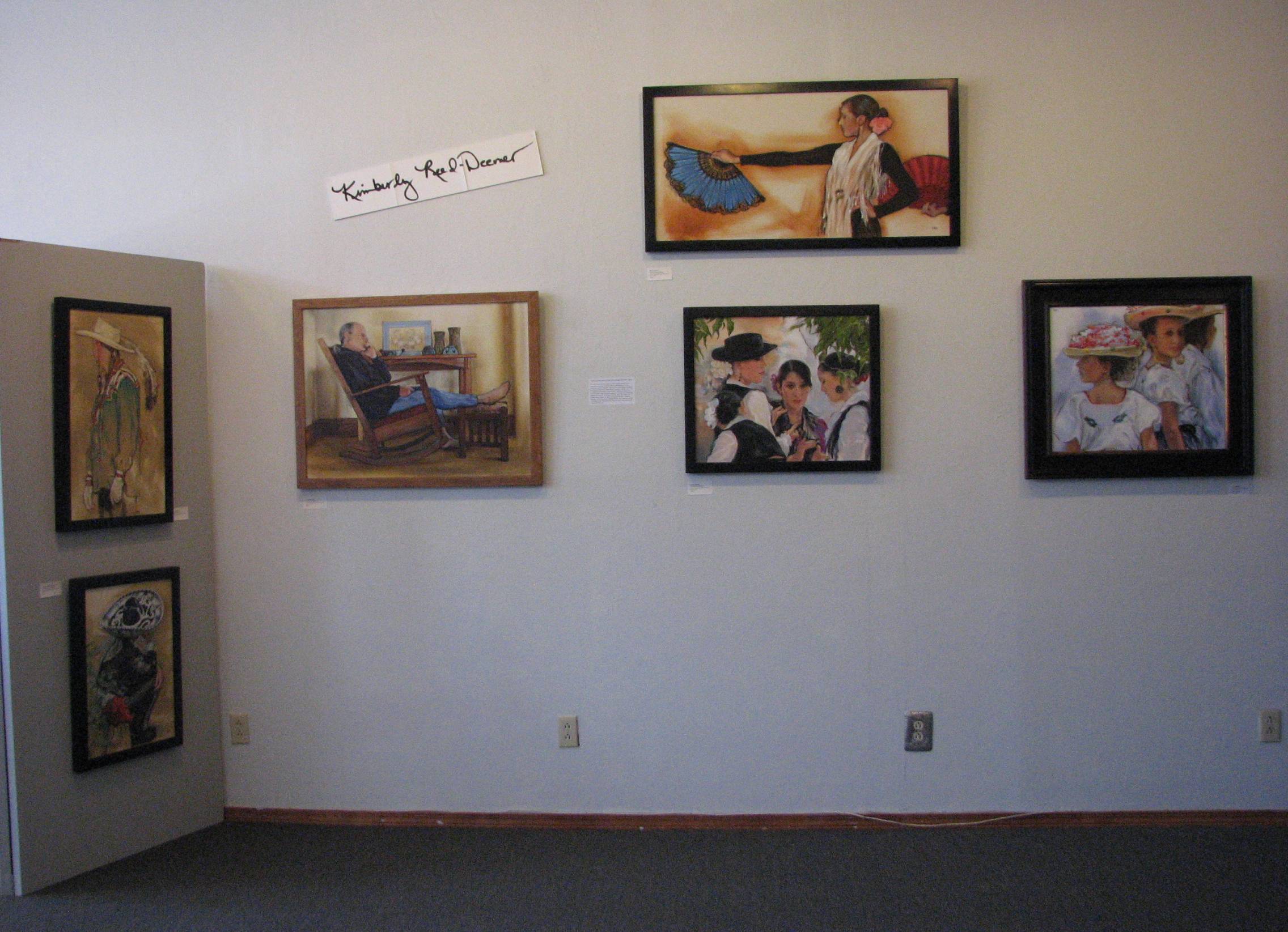
Neighbors, Friends, Artists
The growing arts community in Las Vegas, New Mexico, is not just a cluster of indifferent strangers working in isolated studios. The exhibition at Gallery 140 of the Las Vegas Arts Council, ‘Across the Alley,’ is a collaboration of three creative people who are also good neighbors and friends. The husband and wife artist team of Kimberly Reed-Deemer and Milt Deemer, along with next door neighbor Nancy Camacho, will be showing their works in a three person show at Gallery 140 during the month of June, 2011.
Reed-Deemer's paintings range from classically grounded figures and still life in oils, to northern New Mexico landscapes in watercolor. Her exuberant figure paintings depict aspects of New Mexico culture such as folklorico and flamenco dancers, subjects not dealt with as often as would be expected in a Southwestern art world that seems to be dominated by plein air oil landscapes. To her own watercolor landscapes, Reed-Deemer brings a clear-eyed, Midwestern sensibility. Milt Deemer thoughtfully employs the contrasts of wood, glass, metals and stone to create cerebral and contemplative yet somehow earthy and organic 3-D pieces, both abstract and representational in concept. Camacho's work involves oil still life and powerfully graphic figurative hand-pulled prints that are deeply personal and often auto-biographical. The exhibit is an extension of their ongoing friendship, which began shortly after the Deemers moved in to their 1890’s home that is separated from Nancy’s likewise historic district property by a narrow alley.
Nancy Camacho was one of the first people in their historic Carnegie Library neighborhood to extend a neighborly welcome the Deemers, so when Kim and Milt were offered a show by the Las Vegas Arts Council, asking Nancy to participate was a given. They were already familiar with each others’ work, regularly stepping across the alley to get artistic feedback and advice from one another on various projects, and to visit about all things art and otherwise in Las Vegas.
When Nancy needs wood cut down for her printmaking blocks, Milt is happy to trim the lengths for her in his workshop. Sundays are often spent talking art around a dinner table laden with one of Nancy’s home cooked meals served on china Kim inherited from her mother. Art books from the artists’ respective home libraries migrate back and forth across the alley, much like the Deemer’s cats who spend as much time in Nancy’s back yard as they do in their own. When one or another of the artists needs the insight of a fresh eye, objective critique is just a few short steps away.
The fellowship, friendship and support that characterizes the relationship between these Las Vegas neighborhood artists is reminiscent of the atmosphere of artistic 'communitas' that developed into the historic artist colonies for which New Mexico is so well known. Not surprising, given that it was originally a pair of Las Vegas artists, Mr. And Mrs. Harold A. Elderkin, who in 1886 transplanted their strong sense of art and community from Las Vegas, New Mexico, to Santa Fe to pave the way for what is now one of the largest regional art destinations in the country. There’s just something about Las Vegas that brings artistically minded people together, and ‘Across the Alley’ is in keeping with that long standing Las Vegas tradition.
Gallery 140 is located at the Las Vegas Arts Council, 140 Bridge Street. The exhibition runs throughout the month of June, 2011.
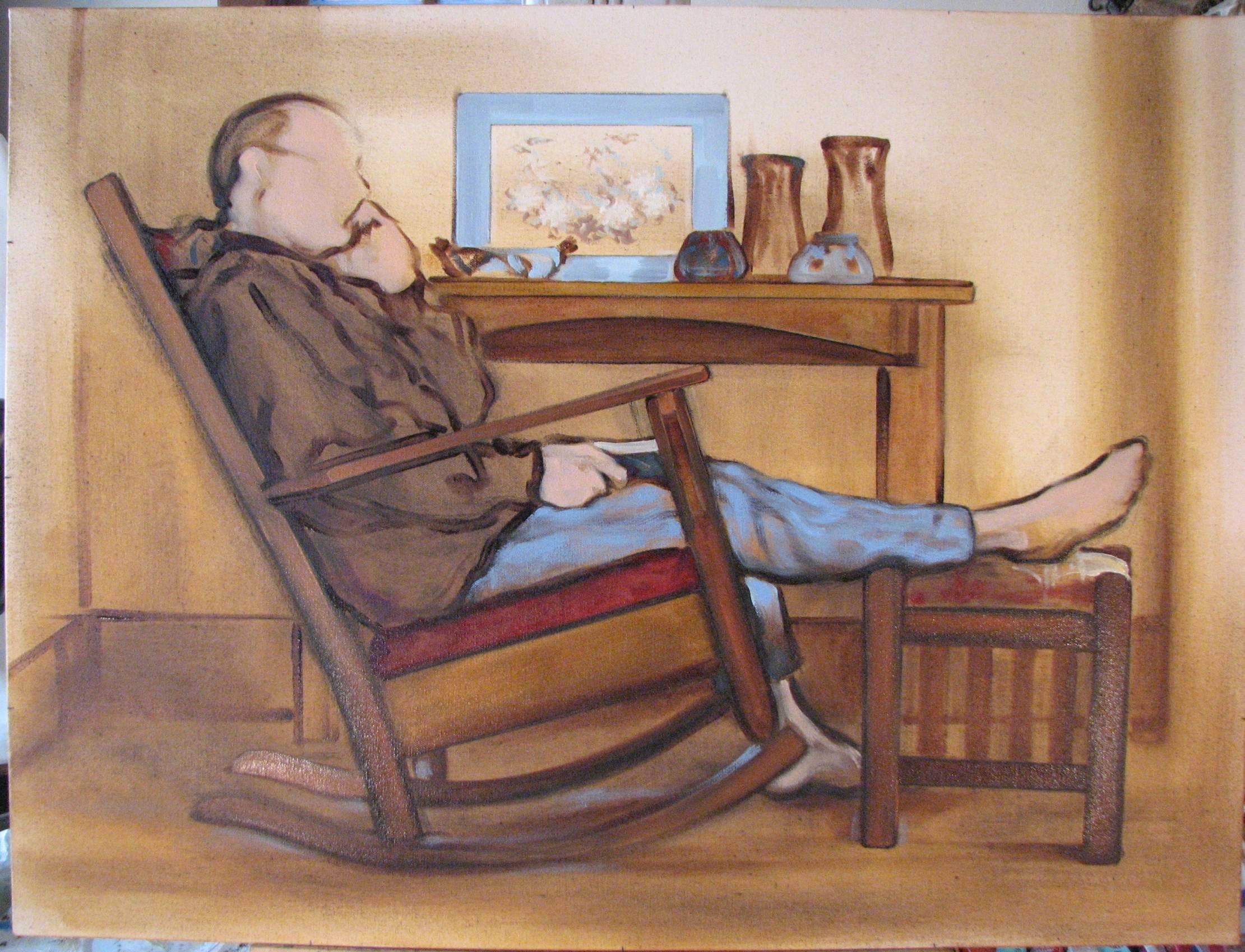
The picture sitting on the table is an oriental painting on silk, which I worked on with a very light hand. It is essentially done, but will eventually need a few touches here and there with some gray-green. As is the case with so many compositions, too much fuss with details can rob a painting of its life, so I was very careful not to overwork the silk painting.
I began blocking in some skin tones in a middle flesh value. I'm letting that dry and then I'll go back into the face, hands and feet with some darker values with stronger color, and finish off with some highlights. I like the lines of the under drawing, and I do hope to be able to retain at least some of that line work in the finished product.
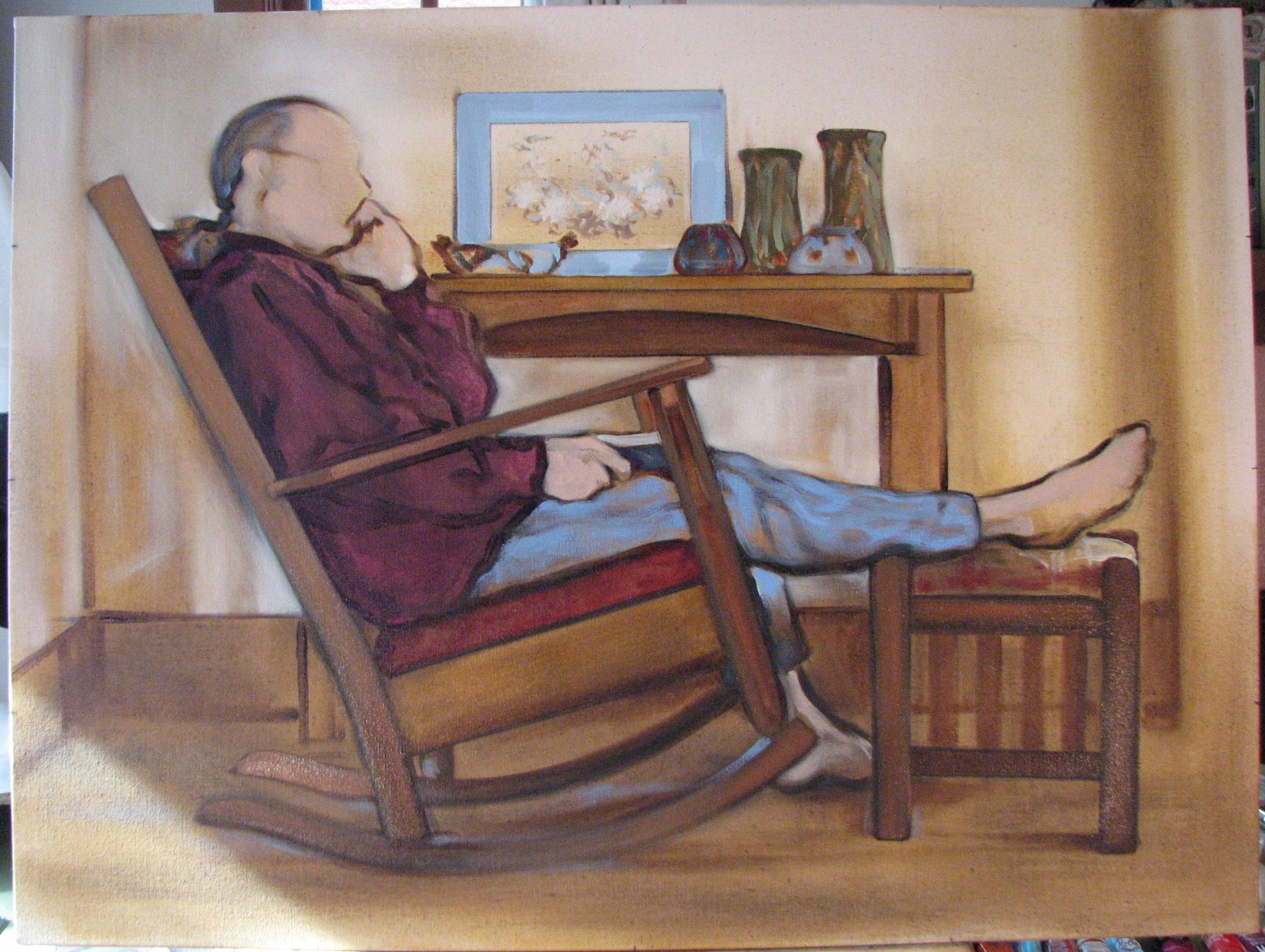
My husband makes furniture, so I posed him sitting in an antique Arts & Crafts rocker in front of one of his Arts & Crafts inspired table designs, with one foot on an antique A & C footstool that we restored. I placed some pottery on the table as a counterweight to the mass of his form. I like the way the arcs of the chair rockers are echoed in the arc of the table apron, as well as the pottery and my husband's ankles. These curved lines work well against the very straight lines of the furniture.
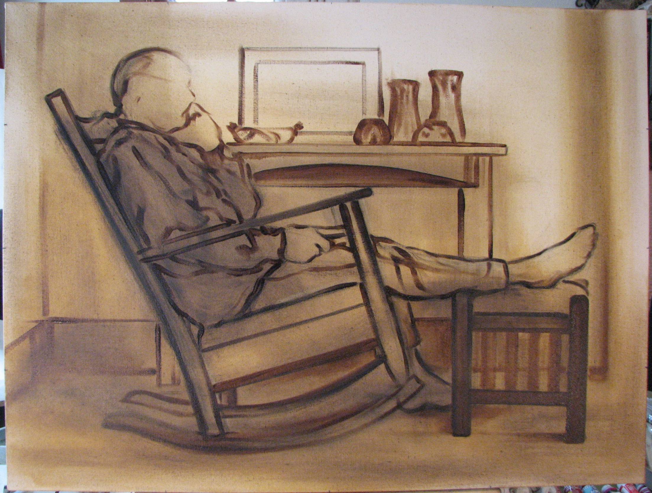
I did the initial layout last night in siennas and umbers, beginning with a fluid wash of umber and then going into some of the darker areas with a very thin wash of sienna. I drew the figure and the furniture in with a charcoal pencil first because I assumed I'd have to restate some of the complex lines and angles several times before I had them right, and I can erase the charcoal to some extent. After I had the underlying charcoal drawing settled I went over the charcoal drawing with paint.
The light in this scene transitions very softly from pale areas to muffled shadows. Although I don't have the colors blocked in yet in this photo, the color relationships in the setting are also interesting, and I deliberately chose the objects, including the color shirt my husband is wearing, for their compositional role.
The composition of the dancer below was unusual because of the crossing arm and the extension of the main figure. I was drawn to the repetition in shapes, colors and gestures. I may go back into the lower left quadrant after I sit with it for a while. I want to retain the purples, but I'm considering whether it needs some diagonal splashes of the yellow-tan color seen in the upper portions of the painting. The more I view it here the more I think it may require it.
26" x 18"
oil on transparent gessoed canvas
It's a decision each artist makes for her or himself of course, but is there any subject that I personally would avoid? Sure, and usually it has in part something to do with the dangers of sentimentality (see my archived blog post from February 15, 2011). Or it’s something at risk of being trite, or something that may be of substance but, unfortunately, recently overdone by too many other artists and thus on the road to becoming trite. While I enjoy the idea of reinterpreting or re-inventing an interesting subject that’s been done by others over time, if it’s currently the hot, trendy subject matter of the month and I’m seeing it everywhere I won’t touch it, at least for the time being because the massive overexposure means it may be prematurely dismissed. And there are also some subjects that even the coolest, most restrained, most objective or most skilled eye and hand can’t entirely salvage—once you get over the momentary, initial distraction of the brilliant technical handling you’re still left with a corny, dowdy or ‘kitsch’ subject. So yes, a lot of the time the way a subject is painted is surely the thing, but subject matter still deserves some thoughtful consideration.
The real challenge is the white detailing along the suit. Last night I began to tentatively address those details--tentatively being the key word. It would be a mistake to go into that detailing too minutely, but I still have to indicate the intricate white embroidery in some manner. What I've done so far is OK, but there is work yet to be done. The general idea is to indicate the highlighted areas of the design, or what the eye would actually perceive while focused on the center of interest. I'll update on this painting when I get it to a satisfactory point.
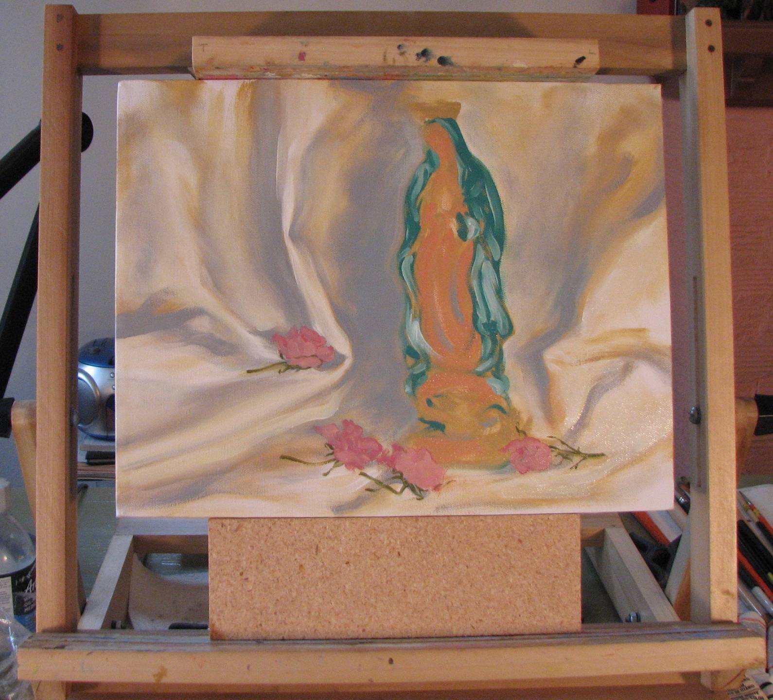
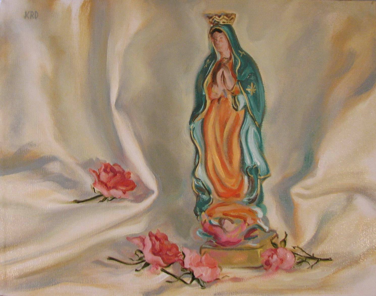
Off the subject: I found out the other day that my 'Guadalupe and Roses' Devotional Exhibit painting sold-! (see February 22, 2011 blog entry).
My husband does sculpture, so the focus for the afternoon was galleries that would have 3-D works. We spent most of the afternoon at Zane Bennett, a large gallery featuring contemporary art. We hit a couple others featuring similar types of work, but there was so much to look at and of such high quality that we lingered for some time at Zane Bennett. Obviously, my work is representational, but it's refreshing to view work that is at the other end of the spectrum from one's own comfort zone, or even of completely different media. These artists may speak a different art dialect, but spoke with eloquence all the same.
I continue work on the male folklorico dancer, mainly getting the hat where it needs to be, but also starting to 'clean up' the red sash. The whites in the hat are taking some time to build up. Wet into wet just doesn't seem to work in some instances because the wet paint doesn't always want to accept a brushload of additional paint. Drying time is thus occasionally required in order to more densely build up an area. I'm also finding that lighting conditions are varying widely in my studio as the days get longer and the sun gets higher in the sky, and it's getting harder and harder to photograph work there with any consistency in color and resolution.
The other challenge is all of the black. I recently consulted several of my artist books to see how black has been dealt with by various artists of the past. It appears that black was depicted in a wide range of ways, from a thin glaze over a warm ground to nearly opaque. There doesn't seem to be a hard and fast rule. Thus it seems that I'll have to continue to work it out as I see fit in each instance. I painted a gouache and watercolor of a fiesta parade rider in a similar costume last year and I found that in that particular instance I had to crank the values up a lot more throughout the costume than they appeared in person. Making the blacks dark in that case just didn't work--it would have given the figure an undesirable oppressive quality.
Directly below is the result of last night's session where I was beginning to deal with summarizing the complexities of the hat. It has bright, silvery white braid and starburst threads, all on black felt.
Today I drew the figure in, lightly first with a charcoal pencil, and then with a brush and very thinned out black paint. At times the paint was so runny that it dripped, which was OK in some places, but I had to take care to watch for any unwanted dripping. He's wearing a very intense red satin sash, so this evening I'll block that in and perhaps address some additional background colors, but taking care to go easy for now with the background.
***I haven't blogged on my canvas preparation experiments yet, but after I have a few paintings completed on these trial canvases I'll summarize the process I've been trying out.
'Across The Alley'
A 3 Person Exhibit of Painting and Sculpture
June 1 - June 30
Las Vegas Arts Council
Las Vegas, New Mexico
20" x 40"
oil on transparent gessoed canvas
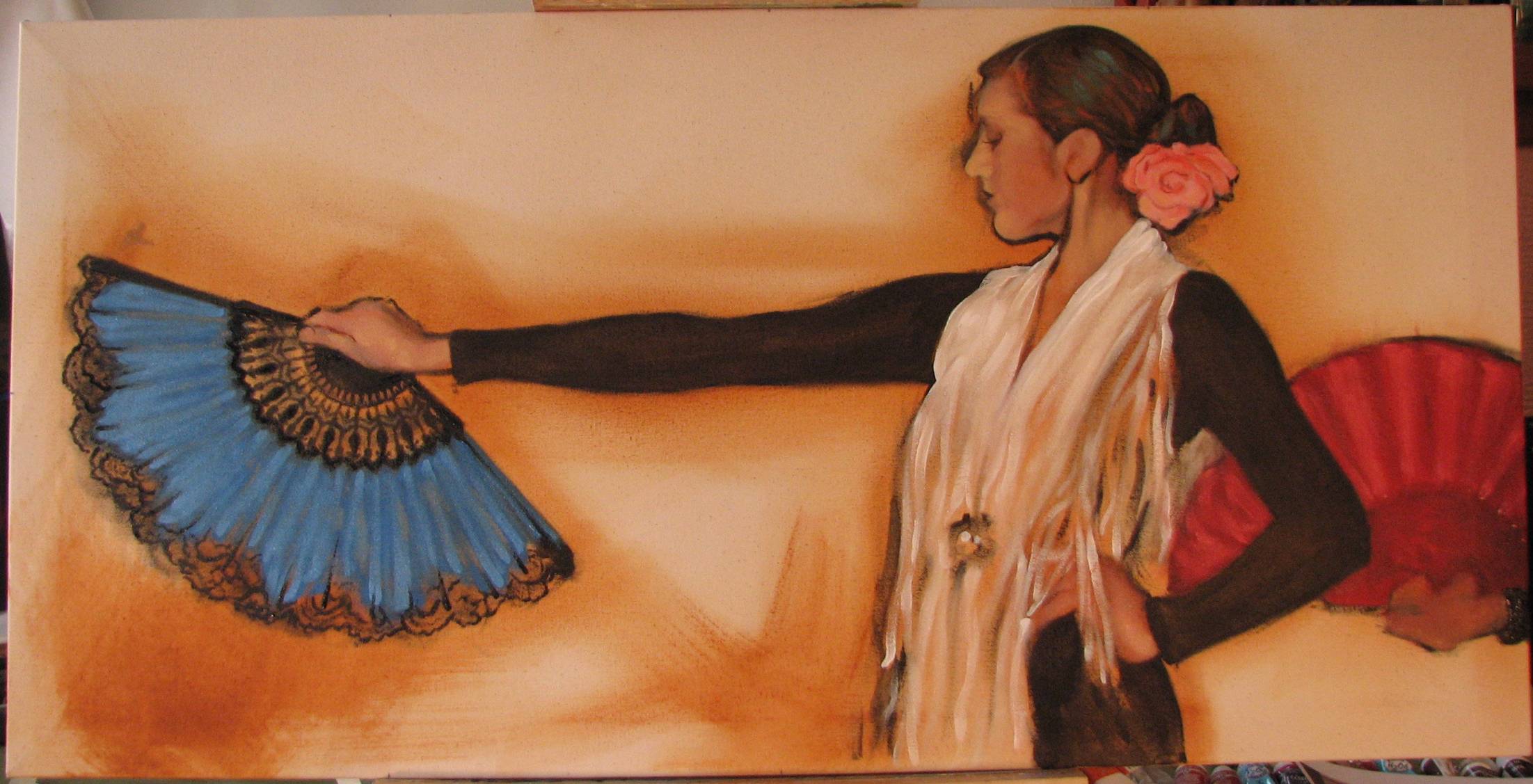
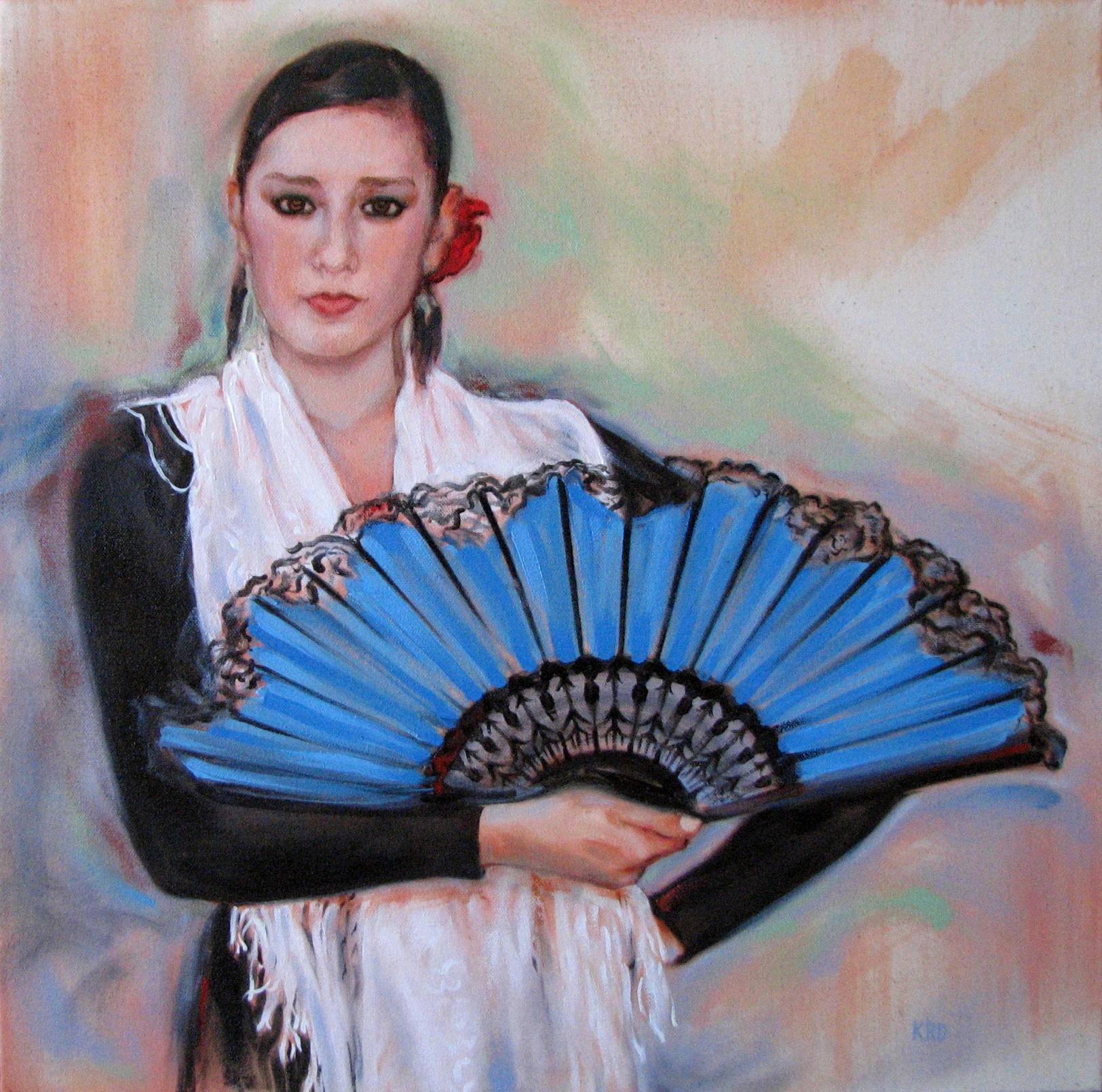
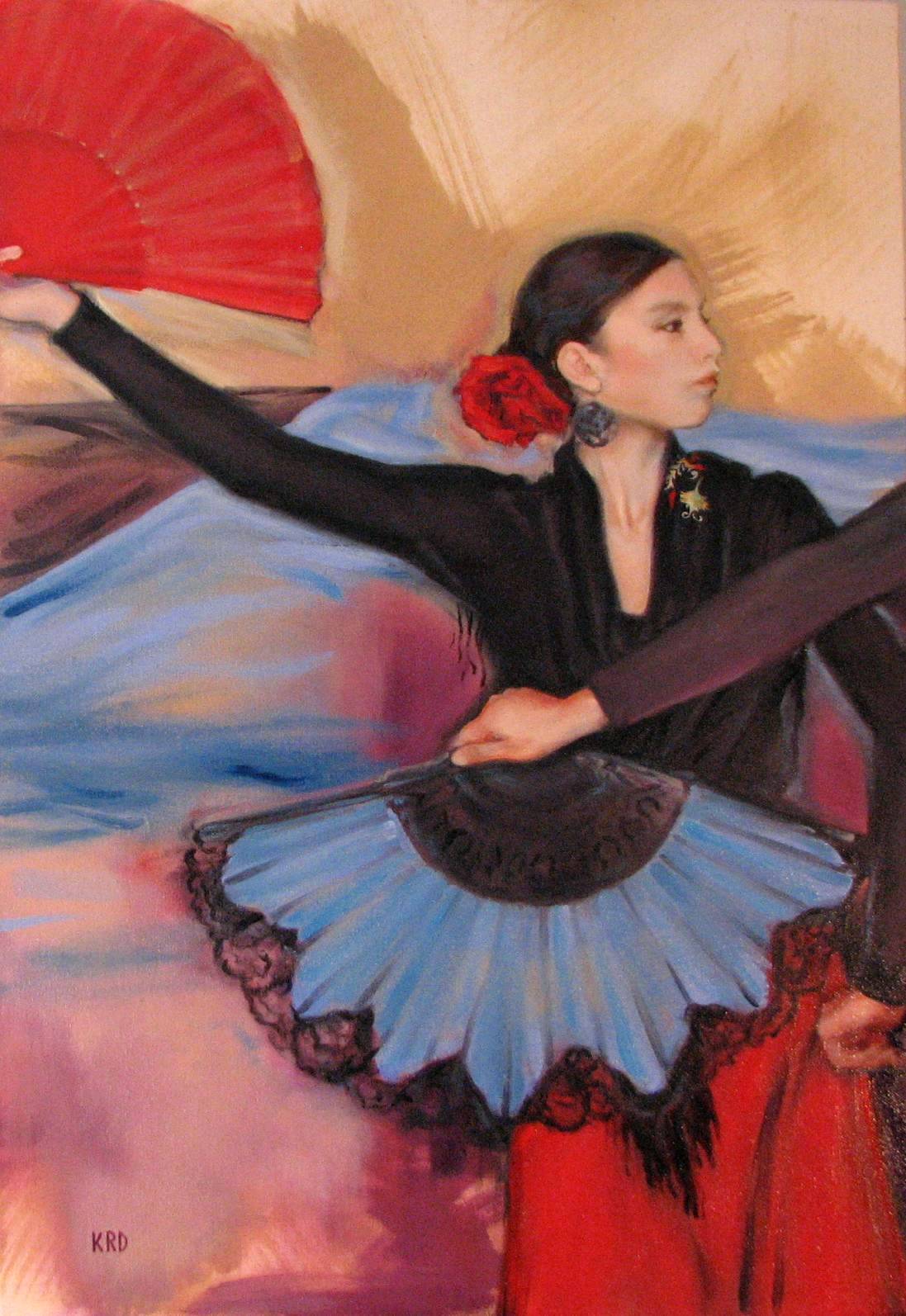
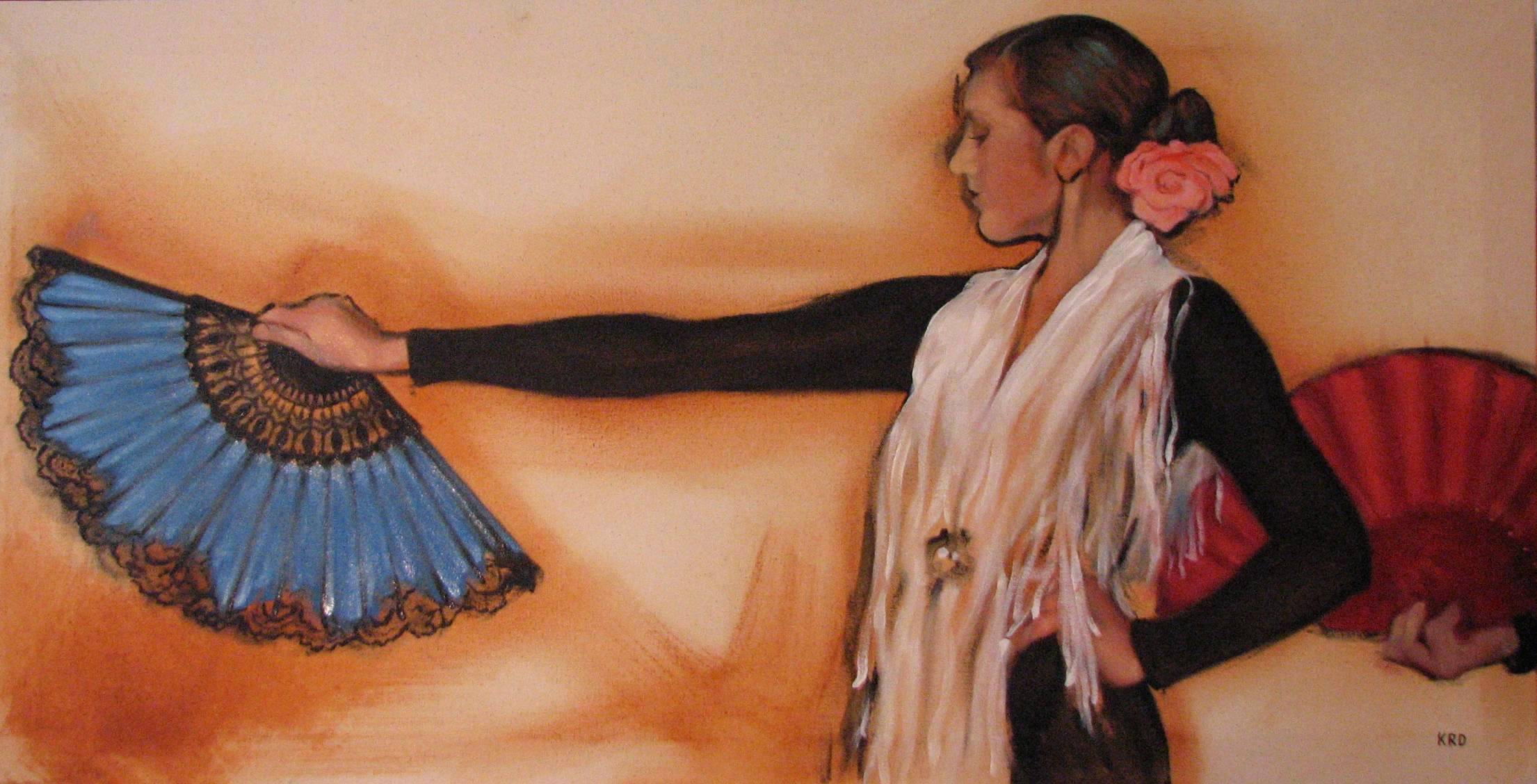
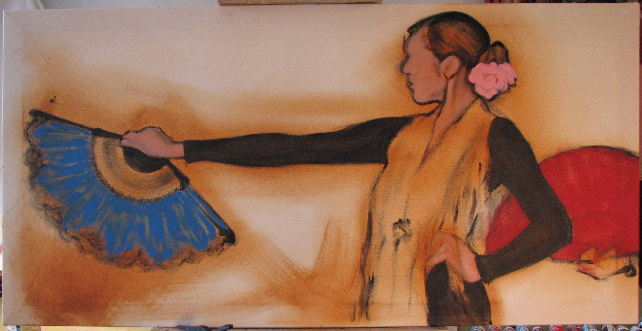
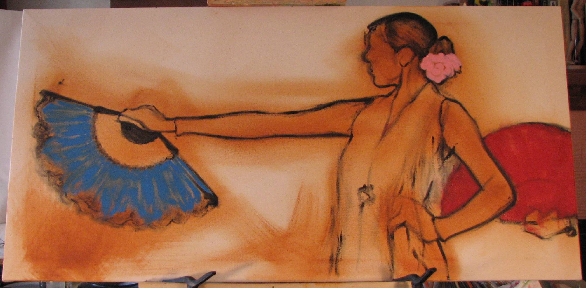
Hopefully today I can finish the lace on the blue fan, which will require a more fluid mix of black paint. I have to think carefully before I delve into it. Indecision will end up in unpleasant smudge, so there is no room for backpedalling. The brushmarks must be spot on the first time.
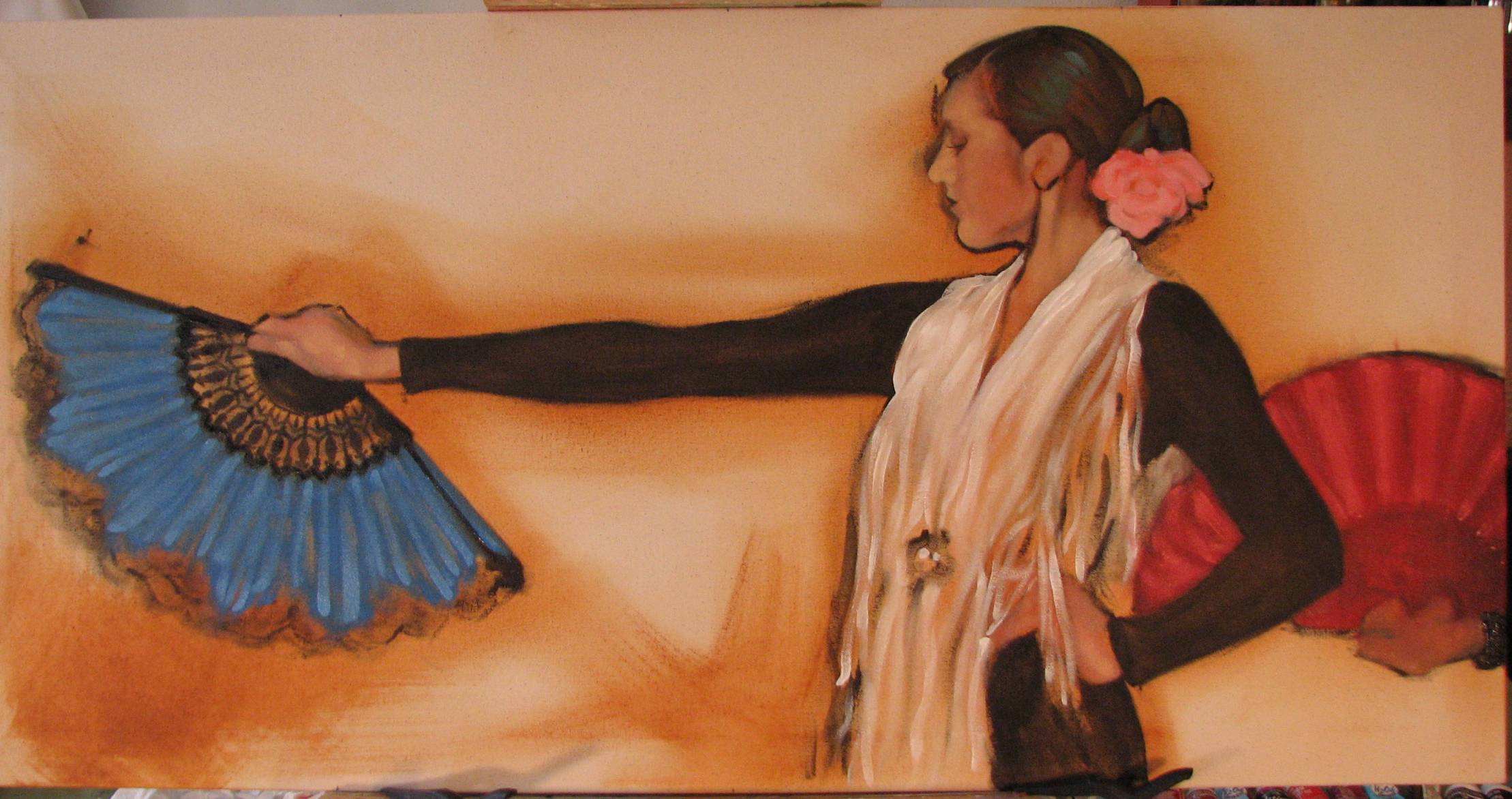
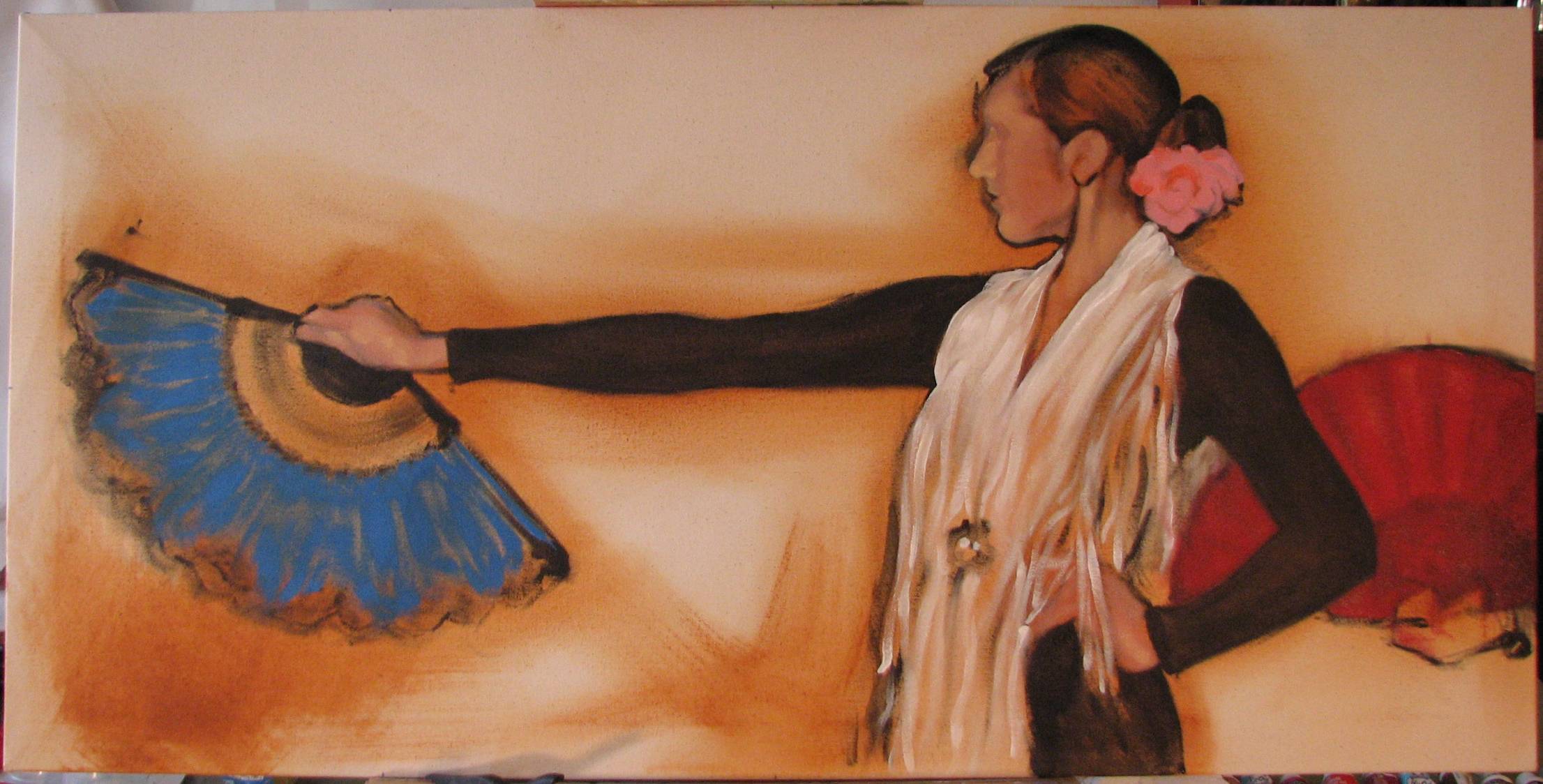
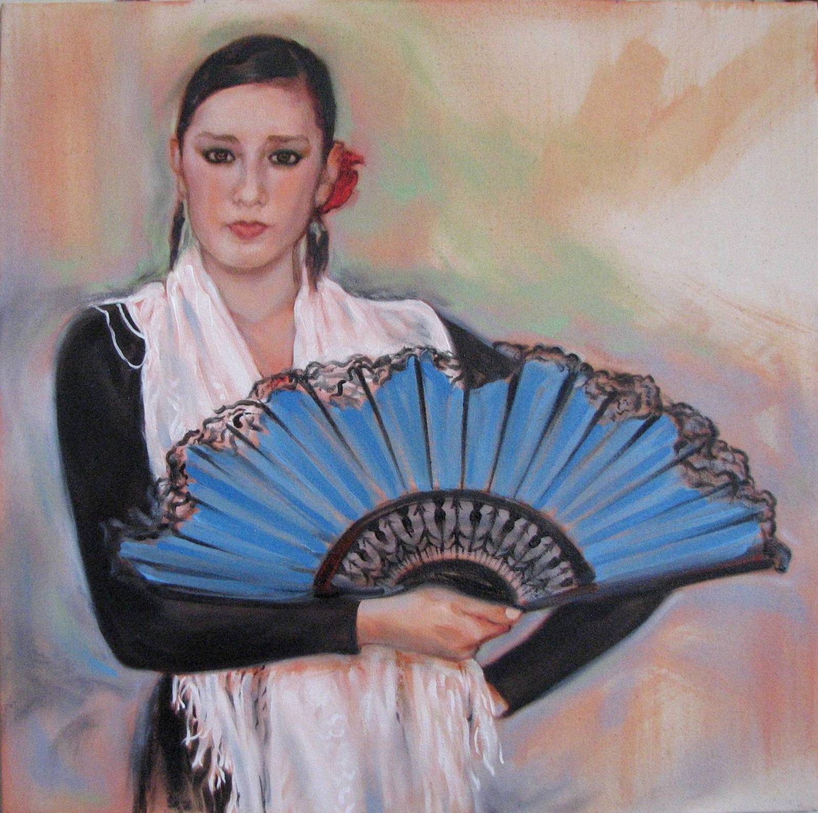
The new oil is of a single flamenco dancer. I toned targeted regions of the canvas with a warm base color (a mix of yellow ochre and burnt sienna) of thinner consistency, and I actually used a 3" wide house painting brush to cover with broad strokes (I also left much of the canvas bare). Then I began to lay in the figure and the fans with pure black paint and a #6 pointed brush. When I was satisfied that I had the figure drawn in properly I began to lay in the local colors of the fans and the hair flower.
I learned from the previous multi-figure painting that when I have areas of black I need to lay in a warm under color first before I proceed to paint with black. This is critical, in that it will allow me to paint 'lean' with the black oil paint and yet have some depth and richness in the blacks. The yellow ochre and burnt sienna under coat will provide that here. The figure is wearing a black dress and a fringed white shawl, and the warm undertone will contribute some depth and variation in both of those elements.
I’ve honestly tried, but I just don’t recall feeling like a victim over the past 30 years of creating representational art. As a young art student, I took art classes at a community college, an art academy and finally a state university, where I had the usual array of great to average to poor instructors, the majority of whom were accepting and encouraging when I met them halfway and truly applied myself. Sure there were a couple instructors with an attitude, but one occasionally encounters that in any academic subject, not just art.
I’ve shown in exhibits sponsored by colleges and universities, in publicly funded exhibit spaces and private galleries, all exhibiting art ranging from non-objective to representational work, and I’ve never felt as if I was treated differently because my work is clearly, undeniably representational. I’ve exhibited in regional museum shows alongside faculty members of the "establishment" state university art department I attended, and I received my first professional art award from another faculty member of that same art department who juried a show in which I was involved. If I was being discriminated against because of my work is representational I would not have had these opportunities.
I’m not saying that my experiences are typical of all representational artists, only that representational artists shouldn’t feel artificially pressured by forces in some corners of the representational art power structure to play the victim role if it simply doesn’t fit their experience. It’s key to remember that many of the most vocal and active of these anti-establishment forces are not actually representational artists themselves, but people who make their own living off of representational artists, or have some vested financial and/or prestige interest in brokering or ‘commoditizing’ representational art. I find it especially troubling that these non-artists are fomenting a cultural environment that pits representational artists against non-objective artists as if they were mortal enemies rather than speakers of different dialects within the same art ‘language’ family, and to what end—too often to their own personal profit. I’m wary of anyone who wants to drive a wedge between artists, to divide and conquer for whatever ends, be they cultural, political or financial.
Just sayin’.
For another similar take on the realist ‘victim’ mentality, go here:
http://briansherwin-artcritic.blogspot.com/2010/09/brian-sherwins-thoughts-on-fred-ross.html#more
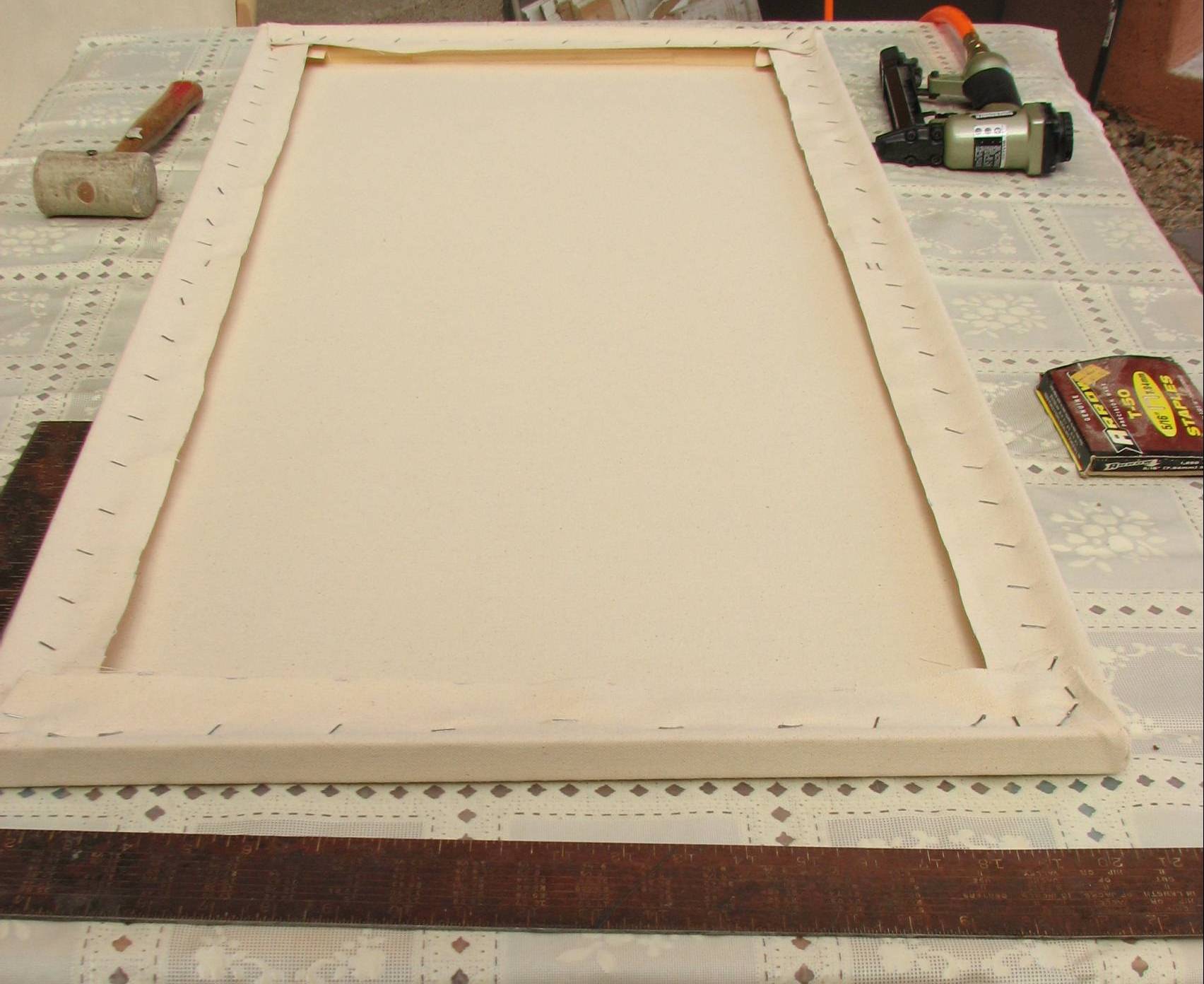
I bought a canvas stretching gripper, and my husband has a compressor powered staple gun. I found a clean tabletop outside in our back courtyard and covered the table with an old plastic table cloth. I assembled the stretcher bars, easing them into shape with a leather headed mallet and then squared them up with a carpenter's square. When I was satisfied that all was OK I placed the stretcher bar frame on the canvas and aligned it square with the weave of the canvas.
The first staple was driven into the center of one of the long sides of the frame, and then I used the canvas gripper to pull the canvas on the opposite side snug but not too tight, and stapled it, too. The short ends were done the same way, and then I worked from the centers outward toward the corners, pulling the canvas snug but not overly tight, stopping about 3" from the corners. I trimmed all the excess canvas to 2," and then pulled each canvas corner across the stretcher corner and stapled in place. I folded the remaining excess at the corner neatly over the corner and stapled it all flat. I think I did a pretty good job for my first serious effort!
The next step is to gesso the canvas, and for that I have an idea in mind that I'm going to try. I've been thinking about the late 19th century artists I admire, such as Degas, Toulouse-Lautrec, and Whistler, and I want to experiment with something. I'll keep just what I'm planning under wraps, however until later...
http://www.washingtonmonthly.com/archives/individual/2011_03/028239.php
For those readers who didn't follow the link, Republicans in Congress voted against ending tens of billions of dollars of taxpayer subsidies to (obscenely profitable) oil companies, who neither need our tax dollars nor want them! I hope that every artist and arts supporter keeps this in mind when funding for arts related programs are eliminated or slashed, not to mention all the GOP’s proposed federal budget cuts in general. This is just one more piece of evidence that conservative cries for fiscal responsibility are a complete sham. Funding cuts are aimed at programs and services that benefit ordinary American taxpayers, while the GOP continues to lard the corporate coffers with our tax dollars.
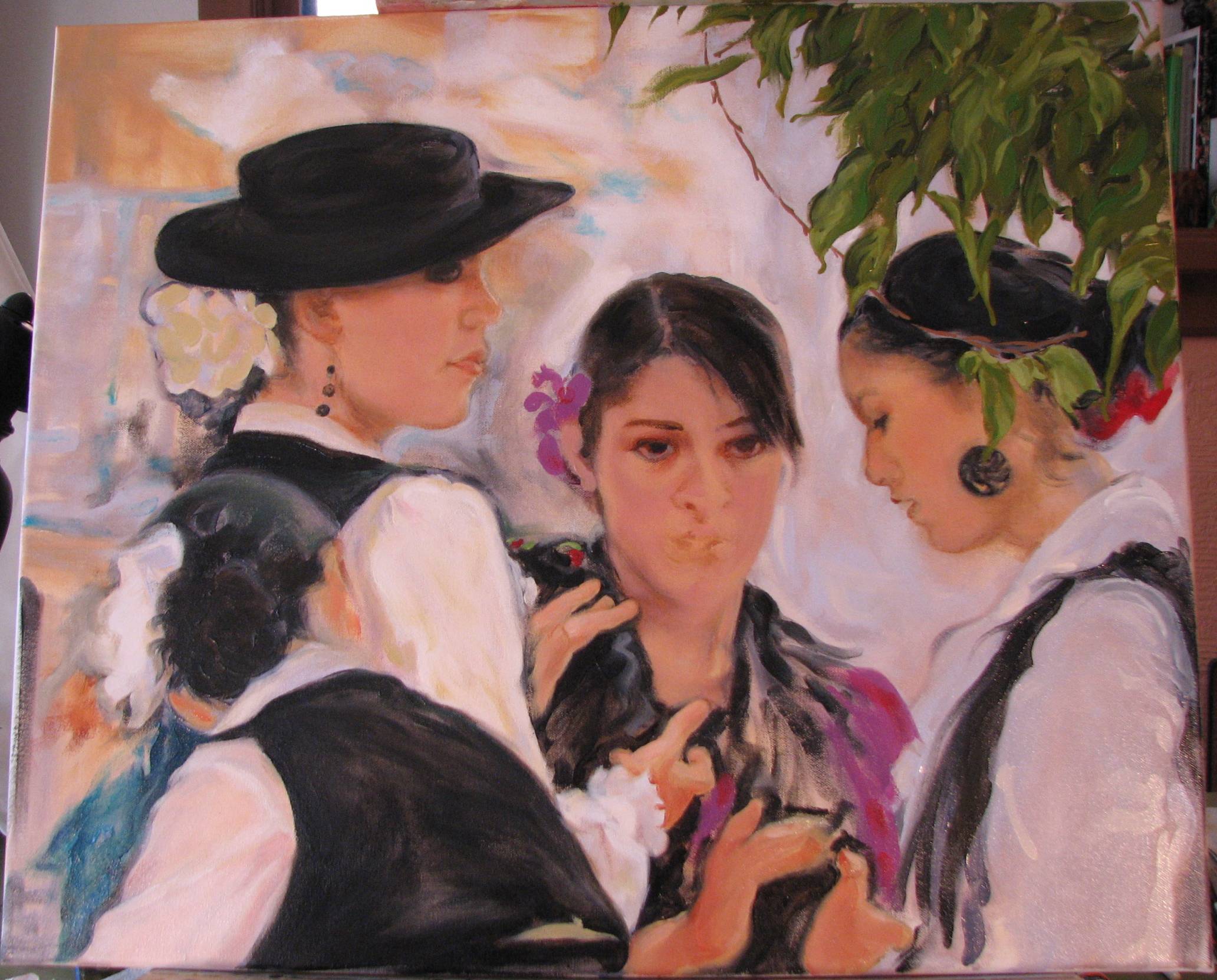
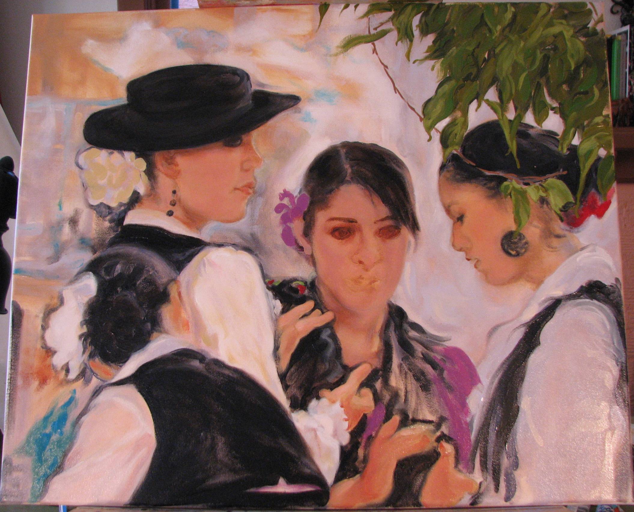
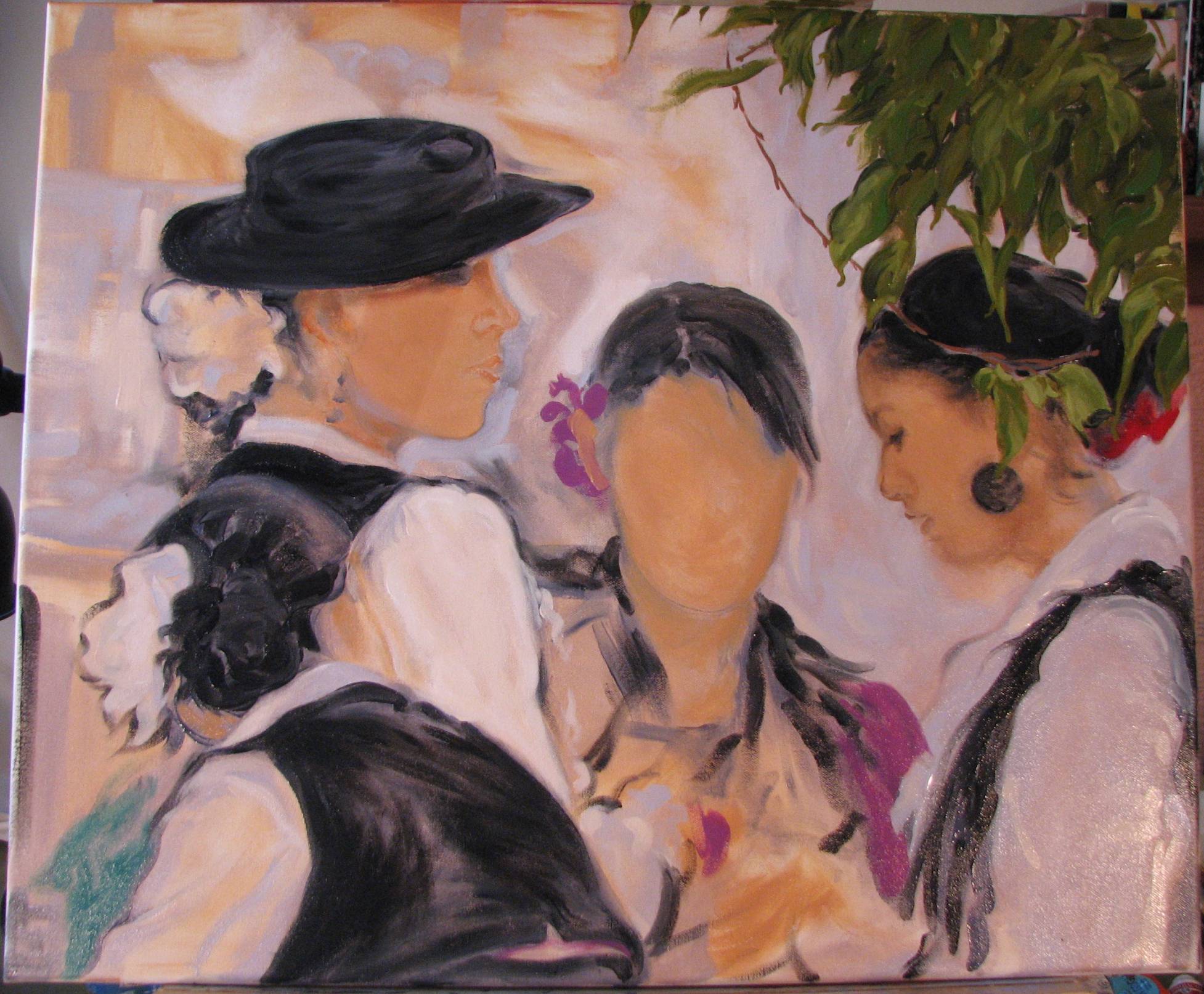
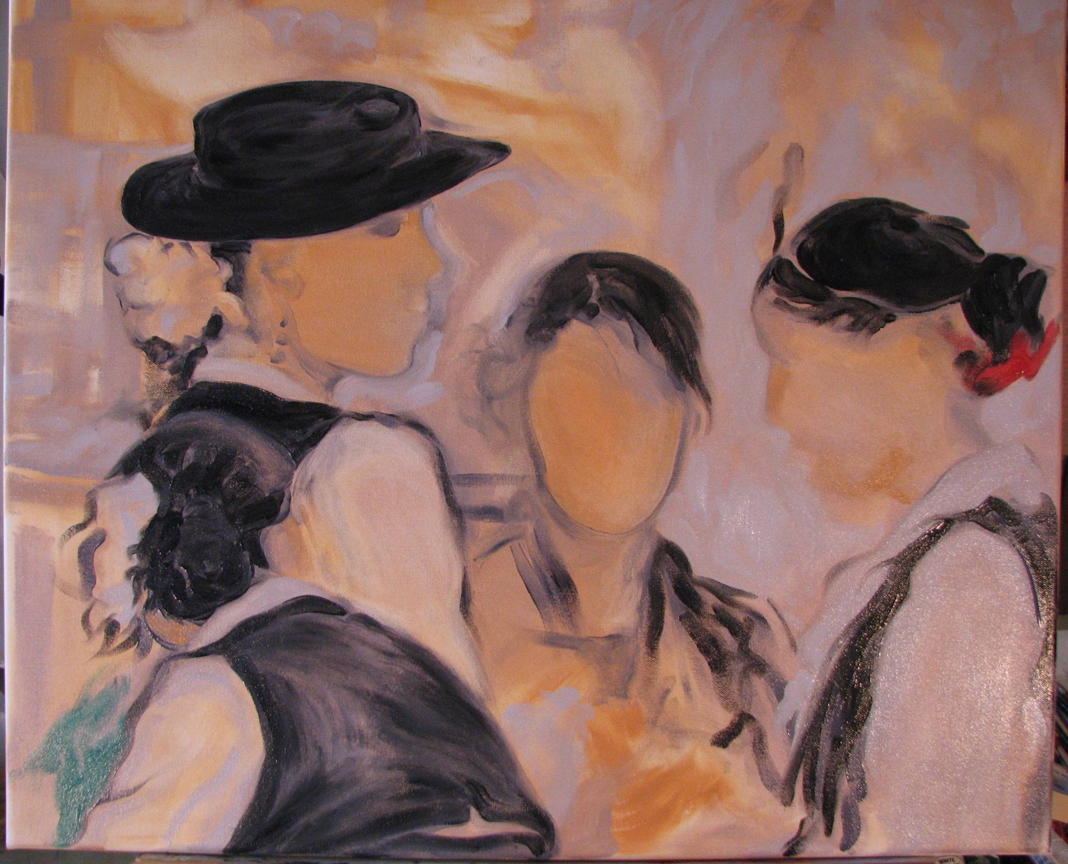
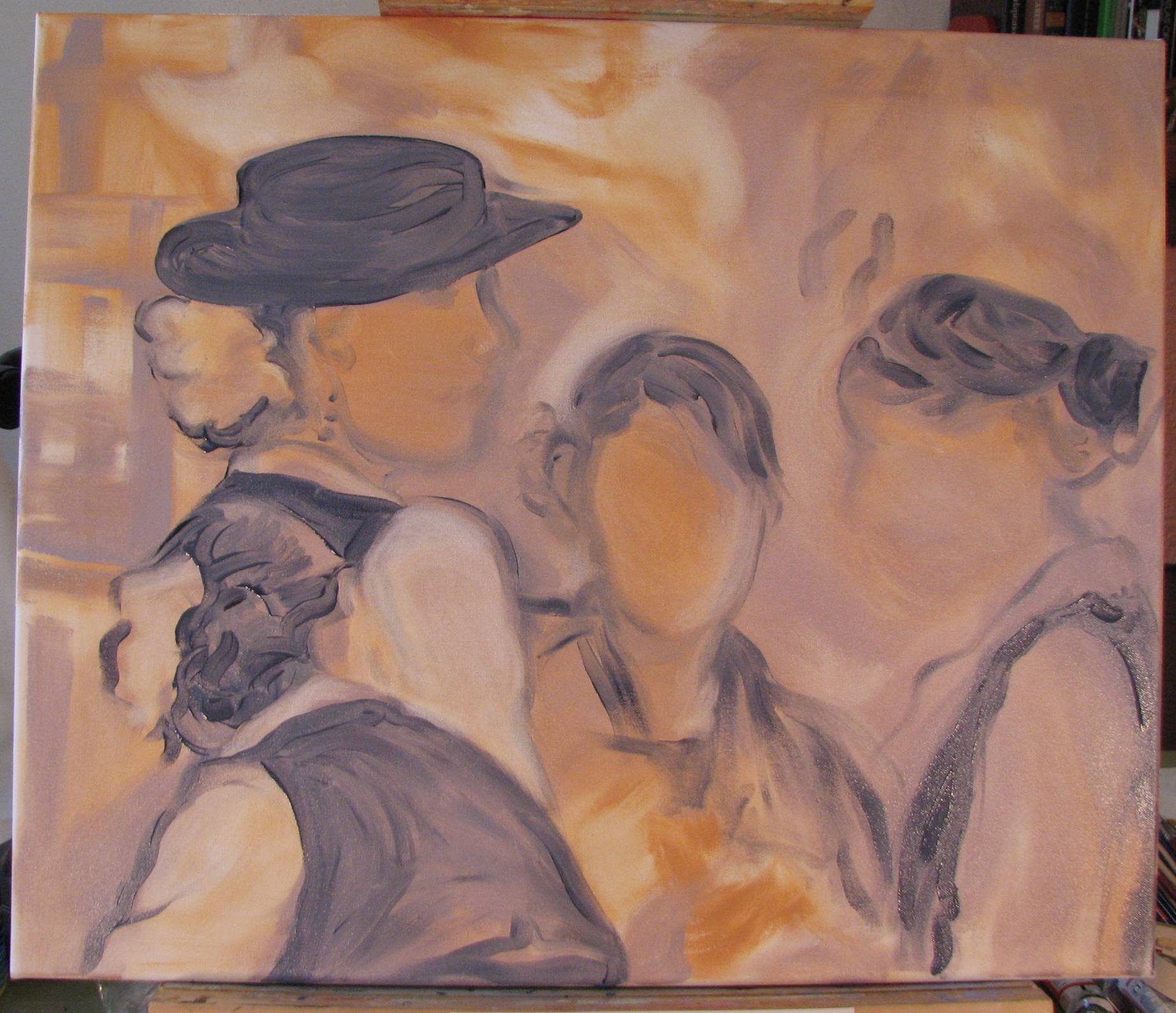
I also carried touches of red into the middle figure's purple dress and hair ornament. As soon as I get the middle figure's face completed, I'll have to make some decisions regarding the rather scrubby looking background. The issue is to suggest the environmental context but in a concise and controlled way, and it needs greater simplification.
Many artists who aren’t familiar with hand pulled printmaking tend to confuse giclees and other forms of mass reproductions with hand pulled prints, referring to mass produced work as ‘prints,’ and signing and numbering their mass reproductions as if they were hand pulled prints. A harmless embellishment? Perhaps, but after having become familiar with all the thought, time, planning and work that goes into a true hand pulled print, I have to confess I think it’s questionable to regularly sign and number giclees and other forms of mass reproductions as if they were unique products equivalent to hand pulled prints. Advocates of the practice point to the fact that often giclees are enhanced with some hand work, but the fundamental product is still not a hand pulled print, and should not be treated as if it were. The artist may be able to reasonably justify signing such a piece under some special circumstances, but numbering them is always inappropriate.
Each hand pulled print is a unique product resulting from many variables, such as progressive wear and changes in the quality of the printing substrate, inconsistencies in the pressure used to transfer each print, and the unique spread and coverage of the ink used in each printing. Each hand pulled print is different, and because the variables effect the quality of successive prints made from the same stone, block, plate or other substrate, they are numbered in the order in which the image was hand pulled.
Giclees and other forms of mass reproductions are nearly indistinguishable from one another, the first reproduction being the same as the last. In fact, two of the main selling points of giclees is their fidelity to the original or primary image, and consistency in quality from the first giclee generated to the last. There is no reason then to number them. In contrast, hand pulled prints don't have an original or primary image done in a specific medium from which reproductions are made through a different imaging process. The first print is a hand pulled print and the last print is a hand pulled print. The first printing of a given series of hand pulled prints may serve as the exemplar against which subsequent prints are measured, but it is not truly analogous to an image done in a specific media, such as oil or watercolor, which is then reproduced via the giclee process or some other type of mass reproduction.
Artists who sign and number their mass reproductions and giclees run the risk of looking amateurish to prospective gallery dealers, collectors and other artists. I’ve heard artists defend their actions by claiming that their customers want them to sign and number mass reproductions. There’s nothing generally wrong with wanting to accommodate and please the people who support and buy our work, but sometimes artists have to adhere to principles and stand firm on what they will and will not do. After watching my neighbor go through all of the labor and care that she engages in to produce her hand pulled prints, there is no way I could sign and number a giclee or other type of mass reproduction and still look her in the eye.
But this is really symptomatic of a larger and more troubling attitude prevalent among more and more conservatives: thinking, or a little bit of intellectual muscle exertion, has for conservatives apparently become a broadly ‘elitist’ activity, as this criticism has been applied by many leading and vocal conservative figures not only to art, but to a wide range of liberal and progressive concerns and interests, for that matter.
No one has to like or appreciate all forms of art, but I think those who have critcisms of non-objective art can do much better than characterizing art they don’t like or understand as ‘elitist.’ What a dangerous perspective that wants people to be wary or rejecting of anything that requires using one’s mental capacity. If memory serves, Nazi Germany didn’t like ‘elitist’ artists, either.
Adhering to competition rules and criteria
By this I mean that artwork juried into the competition and selections for final awards should be made according to the rules and criteria spelled out by the competition organizers in the prospectus. If the dimensions of the work, for example, are to be under a certain size limit, then work that exceeds those limits should not be juried into the competition, much less receive an award. To the point, if the competition rules indicate that work will be judged according to a specific set of technical and/or academic criteria, then work selected and awarded should be consistent with those criteria. There is no reason for stipulating criteria if the competition isn’t going to adhere to those criteria.
Competition feedback
When artists pay entry fees to commercial competition sites and other types of juried competitions they are consumers, and have a right to civilly express their opinions about the quality of all aspects of the operation, including the judging results (I'm not suggesting that artists should have the right to challenge specific judging results, but referring to the reasoned expression of general observations and concerns about the competition and the results). Any commercial competition site or juried competition that in some paternalistic language or effect discourages entrants from expressing their opinions about the competition is eroding artists’ empowerment and silencing free speech. In any business there should be an atmosphere of receptivity regarding consumer feedback, and businesses involving artists should be no exception.
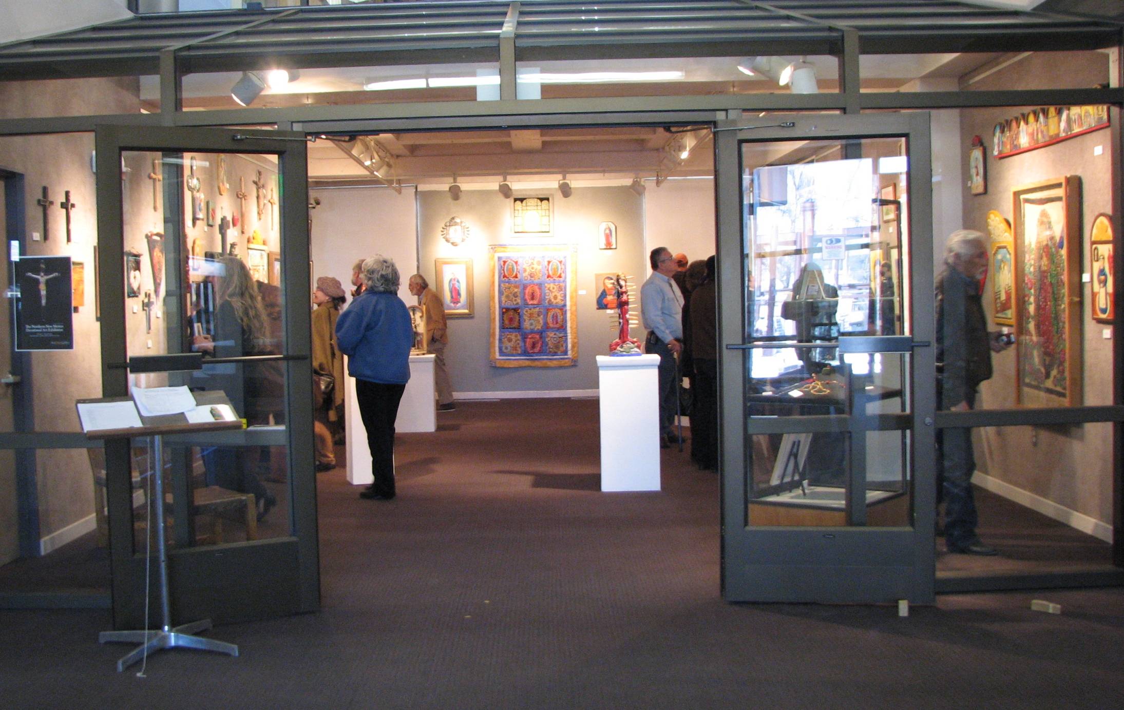
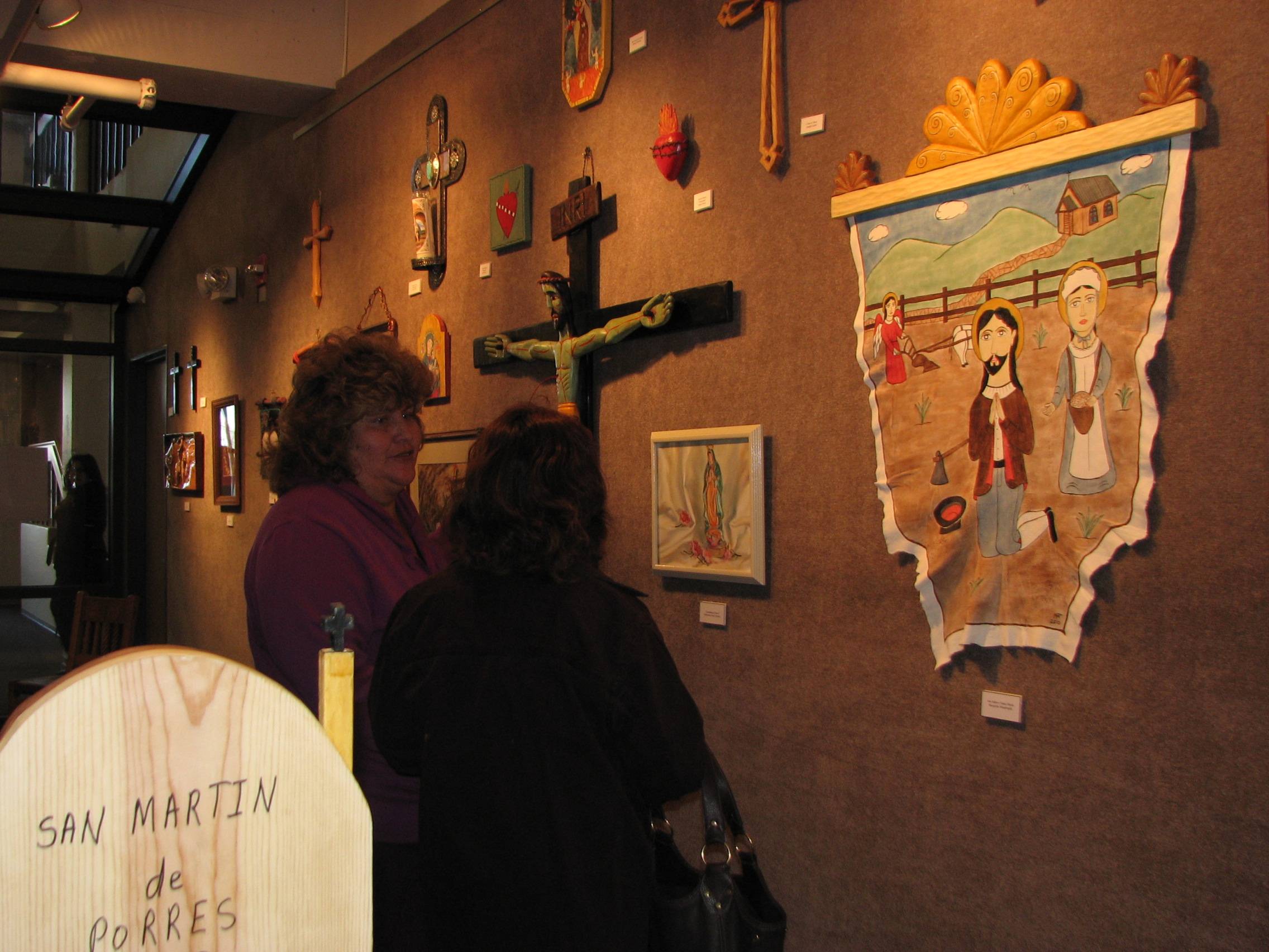
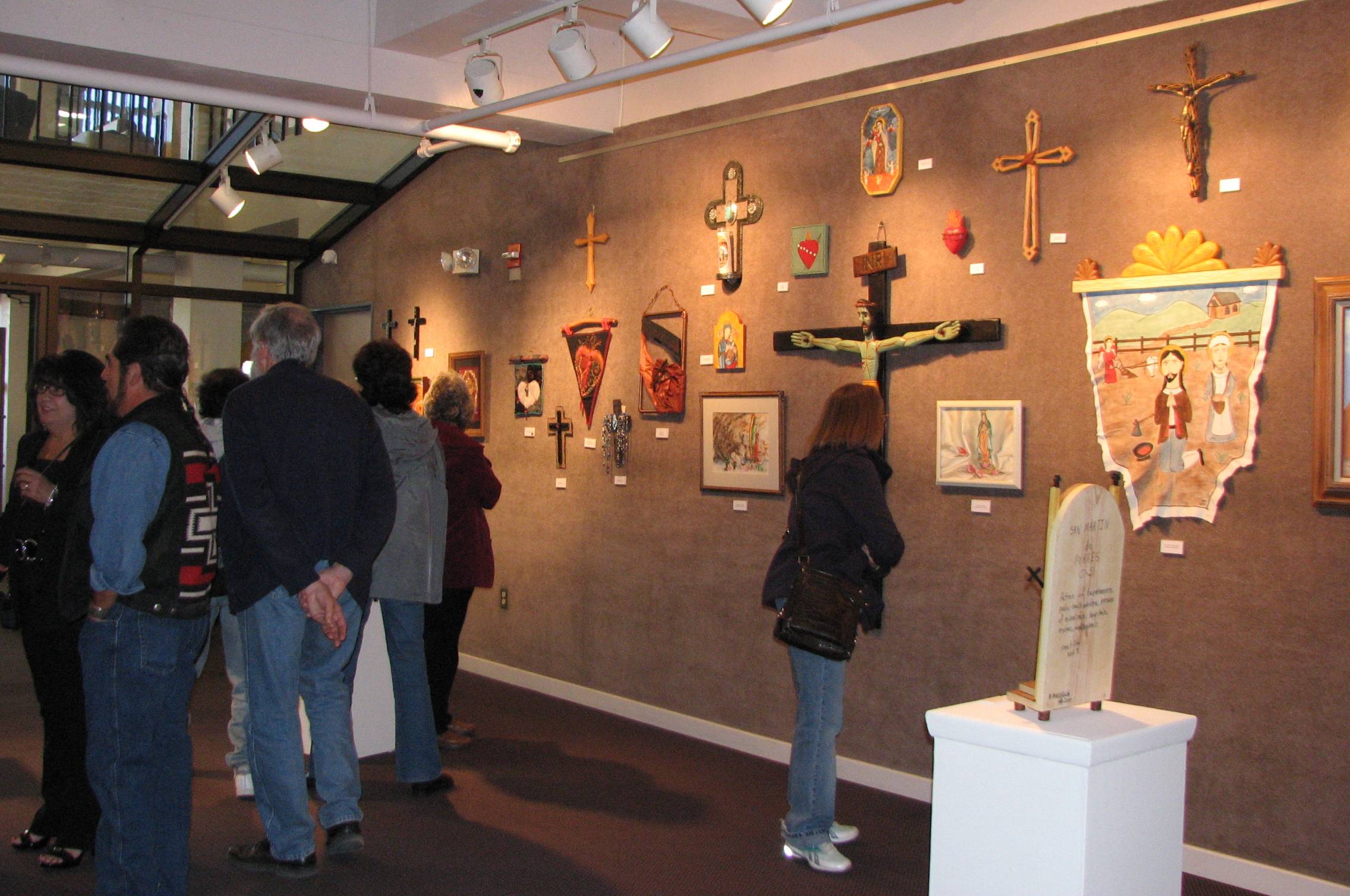
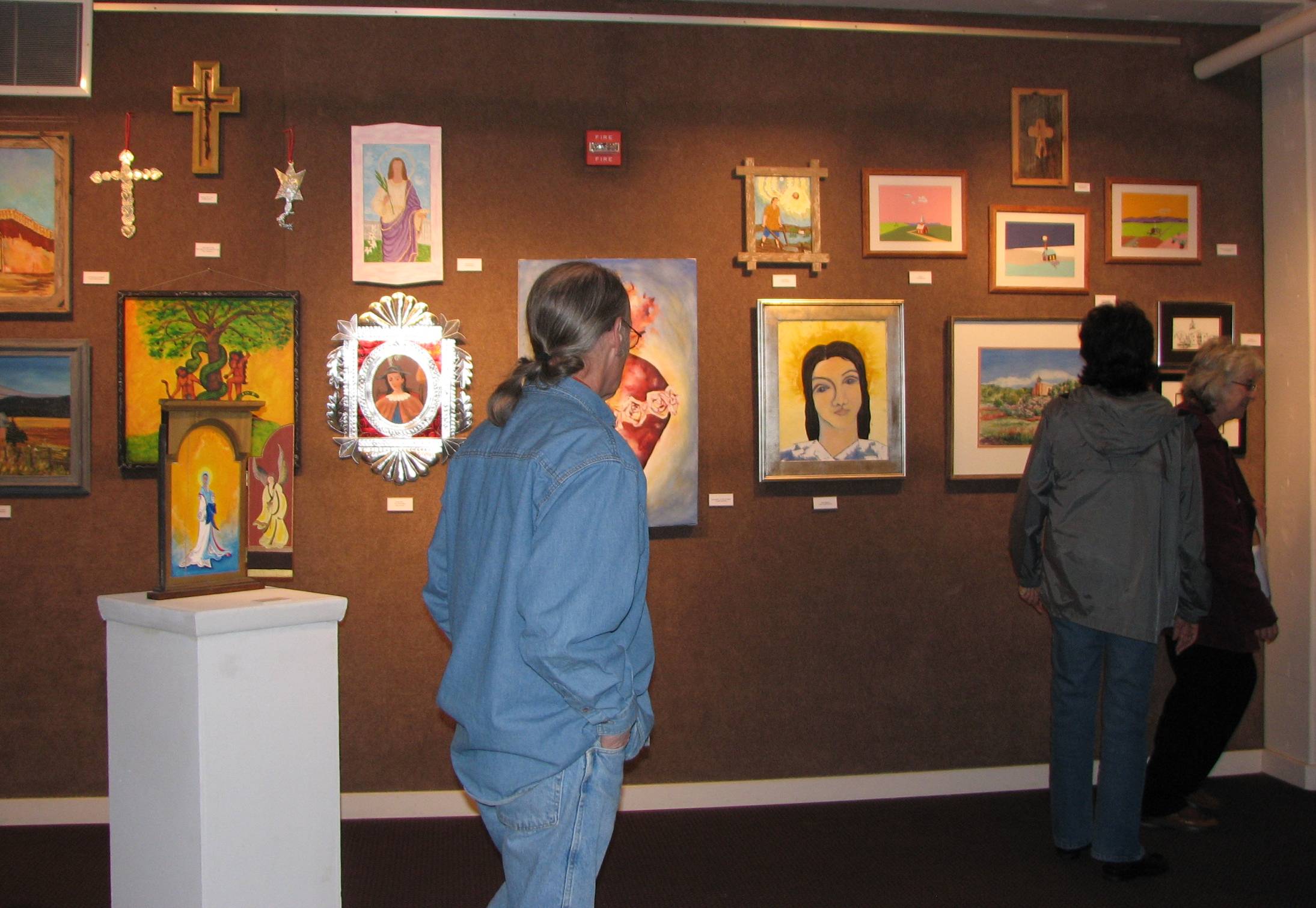
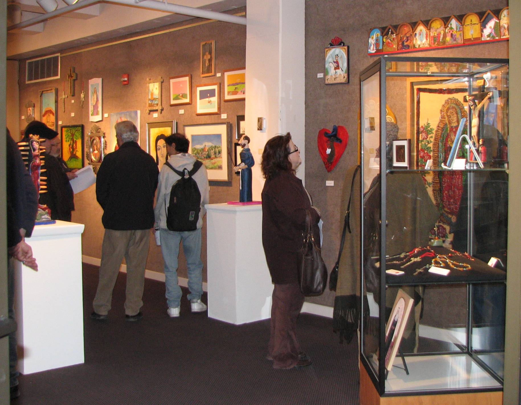
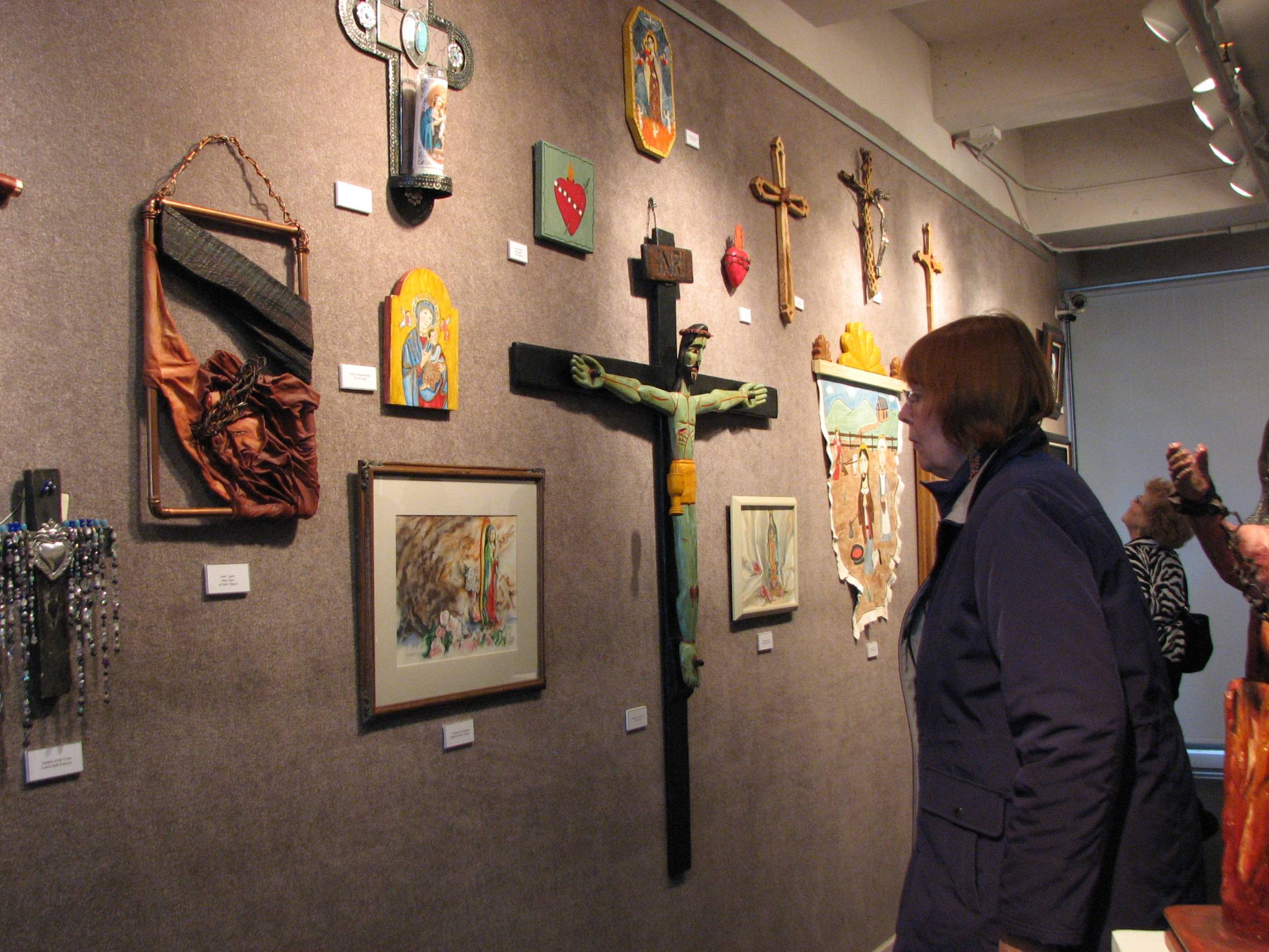
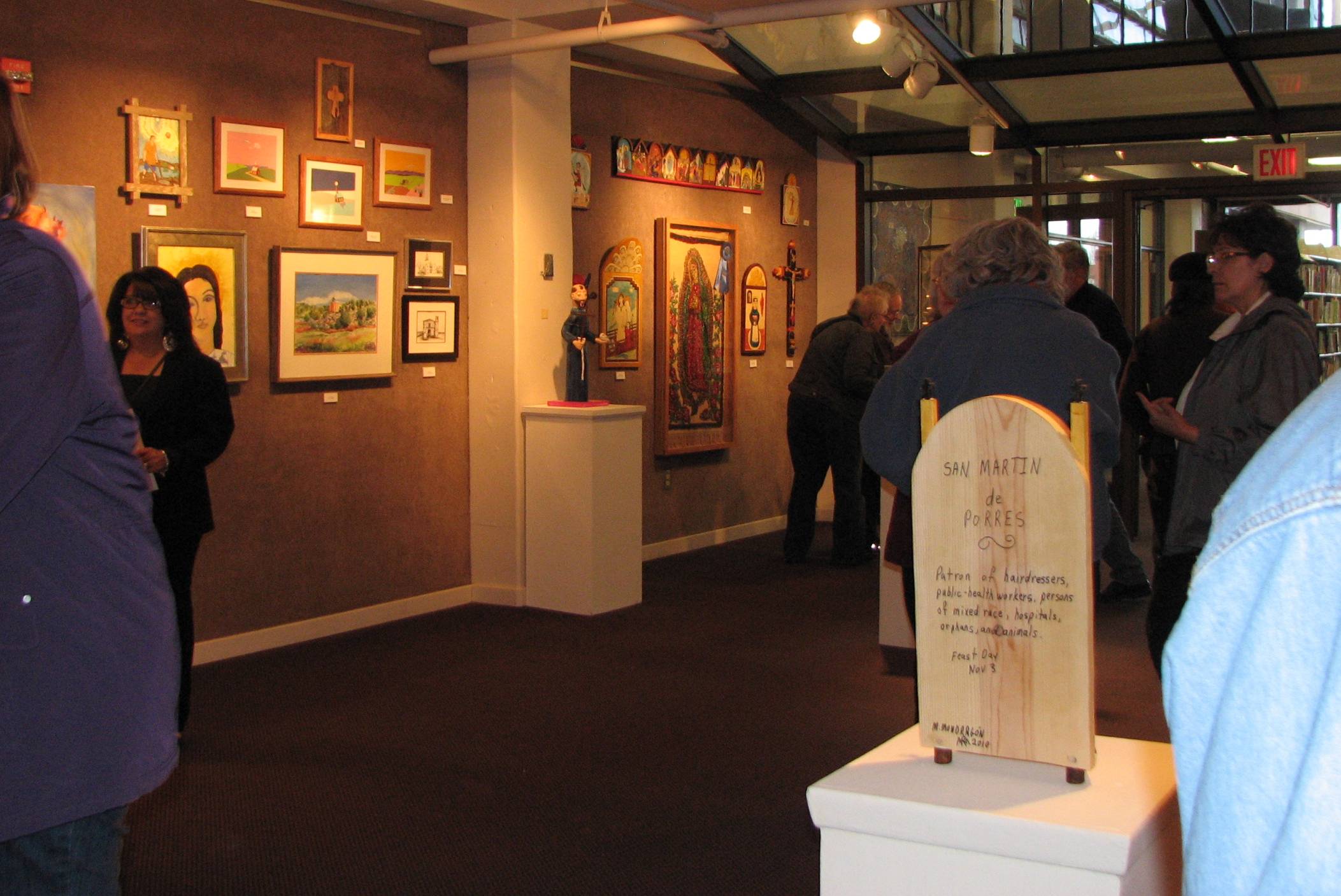
The following photos of the reception show the wide variety of art included in the devotional exhibit, including traditional Spanish Colonial devotional forms called santos (two dimensional depictions of saints), bultos (free standing carved figurines of saints), retablos (larger alter pieces), as well as tinwork and crucifixes. The exhibit also includes more contemporary interpretations of devotional iconography and subjects, and jewelry.
I broke the task down into stages, starting with a warm yellow-green tone in a middle value, and then worked cooler in color, darker in value, finishing with the very lightest values at the end. For much of the time I used a large, flat, stiffer bristled brush, turning to my finer brushes only at the very end to describe leaf points and edge turnings in select, individual leaves.
We may not think of ourselves this way, but artists are also consumers, and like any other consumer, should have the information they need to make informed decisions. It's about basic consumer empowerment. I care about the current and future state of representational art, but the seriousness of the reported resurgence in representational art is called into question if the integrity of significant sectors of the system is compromised. Under the topical heading of competitions, I've written about a number of such compromising factors which I'll post periodically on this blog. Today I'll present some thoughts on the issues of 'transparency' and 'timely notification' in juried competitions.
Transparency
I recently received a number of email notifications regarding a call for entries for an upcoming competition to be judged by an established artist, who was named. The announcement indicated that the judge would chair a panel or committee who would also be contributing to the decision making process, but the announcement didn't include the names and art credentials of those panel jurors. I emailed the sponsor of the competition to get more information regarding the actual composition of the jury. While the sponsor did promptly respond that the primary judge would be seeing all of the entries--which was good to know--they didn't, however, have information regarding who else would be on the jury. In other words, the competition process, at least at this point in the promotion, is only partly transparent.
What I thus mean by transparency in any juried competition is who are the competition decision makers, from the primary judge(s), to panels of jurors, to preliminary committees who prescreen the work down to finalists from which the judge makes his or her selections? What exactly are their relevant professional credentials? A panel of pre-screeners, if a competition utilizes one, is actually more critical to the jurying/judging process than the primary judge, as it is they who determine what work the judge will ultimately see and make her/his selections from.
Artists have the right to know the identity and art credentials of all the people making decisions about their work, including and especially pre-screeners, as these individuals are making decisions that impact artists’ careers. And artists have the right to know this information before they pay their entry fees and submit their entries. There are several reasons that artists need this kind of information, the main reason being that this is the only way artists have of researching a given competition to see if it's really a good fit for their work, or if it's really just a waste of precious time and hard earned money.
Timely notification
By this I mean that artists who pay often hefty entry fees to enter competitions deserve the courtesy of being directly notified in a timely manner if their entries have been accepted or not. Many art publications and art supply manufacturers and distributors sponsor juried competitions, but entrants are often told that “only winners will be notified.” These businesses rely heavily and regularly on email to solicit business from artists, and using their email capabilities to notify all entrants about the final status of their entries is not an unreasonable expectation. Artists should be given a firm date when jury results will be completed and communicated directly to them, so that they can enter their work in other competitions and keep their work circulating.
Last night I started to work on the skin tones and the profile of the dancer on the right, as well as a bit more of the costumes, including some slashes of color in the outfit of the middle figure. The clapping hands will be the last compositional element I address, and these I would like to keep as loose and sketchy as possible in order to suggest rapid movement.
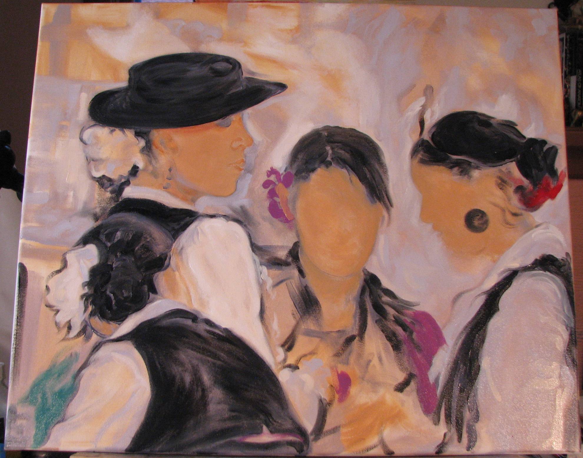
I introduced some paler bluish areas to the background, as well as some spots of bright color on the lower left corner and in the hair ornament of the dancer on the right. Her profile will have to be dealt with very carefully and economically, as there is a beautiful contour line that describes its entirety.
I had read that at a turning point in her artistic development, Georgia O'Keeffe assembled all of her work in a room and destroyed a good portion of her output up to that point. She purged to get rid of anything that she considered 'derivative,' but being derivative doesn't concern me too much. I don't mind gleaning insight from artists in the past or reinterpreting subjects or concepts. My concern is to get rid of anything that's just not any good. This was easy for some things that were clearly awful, but not so easy in several other cases. Either there were pieces with some nice isolated passages that just didn't gel overall, or the idea or motive was good but the execution well below standard. I persevered, however, and threw a lot into the woodstove--the verdicts irreversible! I've been known to throw something out only to retrieve the cast offs later. It feels good to really unload a lot of this stuff. Make way for the new.
As per usual, I did a little background toning first, and now I'm trying to get the placement of the figures settled and the drawing correct--again using dark paint as with the last group depiction of the young folklorico dancers--before doing anything else. This particular composition is more on the monochromatic side, although there are some areas of bright color here and there. The precise gesture and postures of the figures are critical to this painting. As is the exact character of that jaunty hat!
11" x 14"
oil on canvas
I made the move into our new showroom (!!!!) on Thursday, so now all of my finished work is there to be sorted and hung. We're waiting to receive the remaining parts of the picture hanging system that we ordered, so for now everything is stacked along the walls. I took a day to clean and organize my studio, which was long overdue, but it also meant I had one less day to work on this submission for the Devotional exhibit. Being that it's a small painting, however, it should be done in time.